
 みっぴー
みっぴー
今日は、WordPressでホームページなどを作成する際に役立つデザインや装飾に関してです。
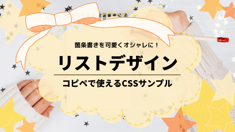
今回は、リストの装飾CSSについて書きたいと思います。CSSとHTMLで「箇条書き(リスト)」の様々なデザインを作ったのでご紹介します!
リストは、「<ul>」「<ol>」「<li>」などを使う下記箇条書きのことですが、記事内でポイントをまとめる時などに使いますよね。
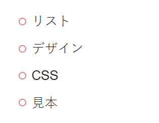
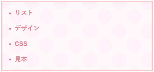
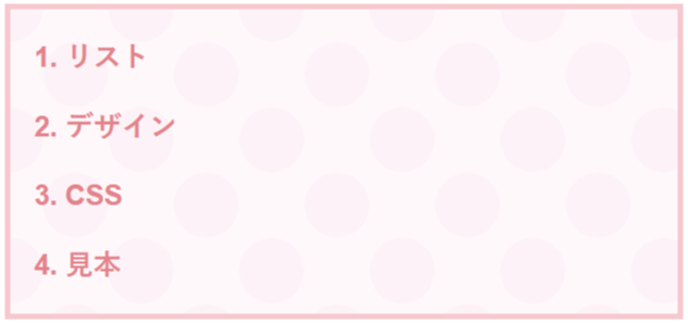
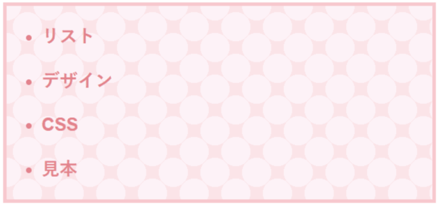
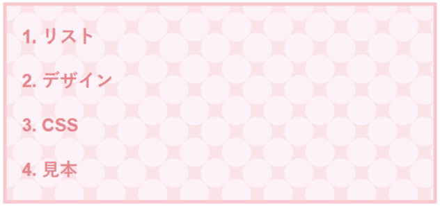
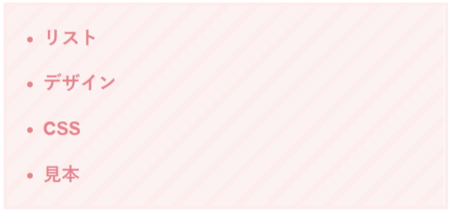
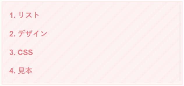
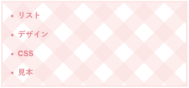
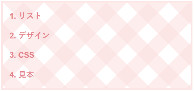
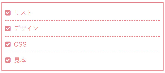
通常のリストのデザインは、下記の左側のようなとってもシンプルなものです。
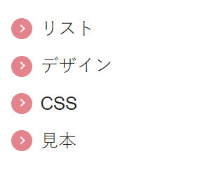
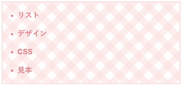
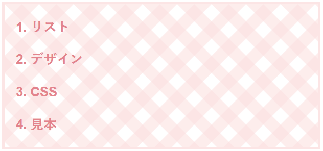
だけど、ブログの個性を出すためにオシャレな可愛いデザインに変更できたら嬉しい!という事で、今回はCSSでカンタンにリストのデザインをオシャレに変更できるように、リストのデザインを装飾するCSSのサンプルを集めちゃいました!
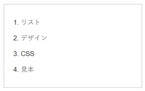
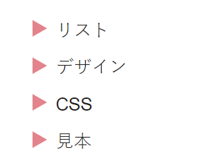
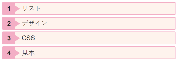
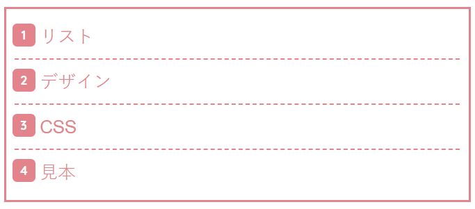
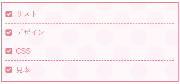
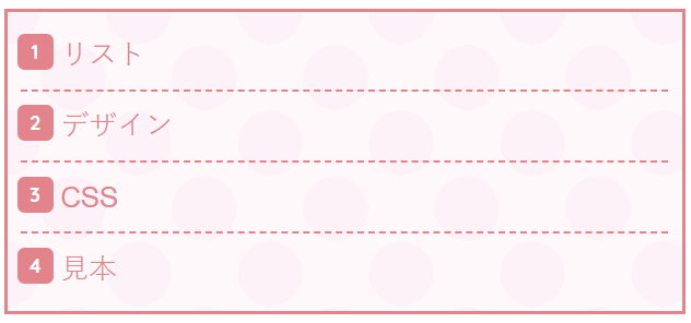
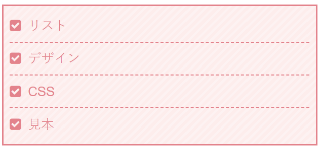
通常のリスト
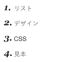
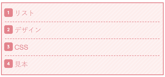
オシャレなリスト
今回は、画像を使わずCSSだけで表現が出来るリストデザインのみ紹介するので、コピペで使用することができます!
HTMLの書き方も一緒に載せますので、使い方が分からない方でも、そのままコピペすれば使えます。
みっぴー
リスト以外にも、「見出し」のデザイン変更のCSSとHTMLは、こちらの記事で紹介してますので、ご参考までに。
 見出しのデザインを装飾するCSSサンプル53選!コピペでオシャレに
自分のサイトが何位に表示されているか?
毎日の順位を自動チェックして記録してくれる必需品!♪
・検索順位をボタン一発で調査、記録。検索順位チェックツールGRC
みっぴー(@bennriya_mi)です~。
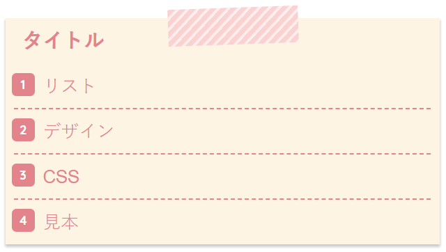
アイキャッチを変えただけで、広告表示回数が5倍になりました。(こっそり独り言)
今回、そのアイキャッチを誰でも使えるようにテンプレにしました。
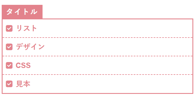
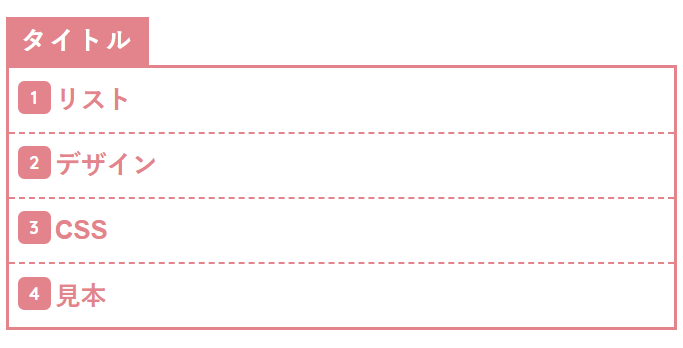
詳しくは、下記にて
目次
- リストデザインの装飾CSSのサンプル
- 【ulのみ・olのみ】リストデザインのCSSサンプル
- 【共通・タイトルなし】リストデザインのCSSサンプル
- 【共通・タイトルあり】リストデザインのCSSサンプル
- 共通・タイトルありのHTMLの書き方
- 17.メモ帳のようなリストデザイン
- 18.水玉模様のノート
- 19.ストライプのノート
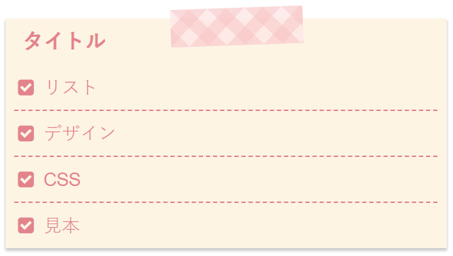
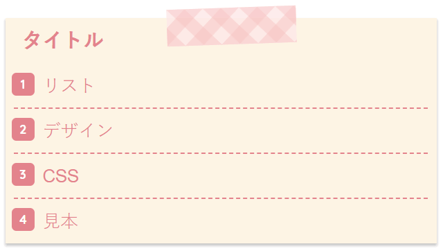
- 20.チェック柄のノート
- 21.区切り線なしのシンプルなタイトル付きデザイン
- 22.区切り線ありのタイトル付きシンプルデザイン
- 23.背景に色を付けてより可愛く
- 24.ハートをつけてもっと可愛く
- 25.全ての項目の後ろにハートを付けたデザイン
- 26.水玉模様のノート
- 27.ストライプのノート
- 28.チェック柄のノート
- 29.影付きのメモ帳のようなデザイン
- 30.水玉模様のメモ帳
- 31.ストライプのメモ帳
- 32.チェック柄のメモ帳
- 33.テープでメモ帳を張り付けたようなデザイン
- 34.水玉のテープでメモ帳を張り付けたようなリストデザイン
- 35.ストライプのテープ
- 36.チェック柄ののテープ
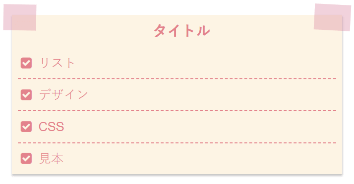
- 37.両側をテープで張り付けたようなデザイン
- 38.両側に水玉模様のテープ
- 39.両側にストライプのテープ
- 40.両側にチェック柄のテープ
- 41.手紙風なデザイン
- 42.水玉模様の手紙風
- 43.水玉模様の手紙風
- 44.ストライプの手紙風
- 45.チェック柄の手紙風
- 46.シンプルだけど線が交差していてオシャレな感じのデザイン
- おまけ
リストデザインの装飾CSSのサンプル
では、ここから実際にリストデザインを変更するCSSとHTMLの書き方をご紹介します。こちらは、そのままコピペしてご自身のサイトで使って頂いても大丈夫です。
cssをテーマのスタイルシート(style.css)に入れて、HTMLを記事内に書く事で設定したデザインが反映されます。
google Chromeだとキャッシュの問題で、スタイルシートに記載してもすぐに反映されない時もあるので、その場合はキャッシュを削除してくださいね。
- タイトルなしの箇条書き(ul)のみで使えるCSS
- タイトルなしの番号付きの箇条書き(ol)のみで使えるCSS
- タイトルありなしの(ul)と(ol)両方で使える共通CSS
修正するファイル
今回のカスタマイズで編集するファイルは下記の通りです。
みっぴー
style.cssだけです!- style.css
【ulのみ・olのみ】リストデザインのCSSサンプル
みっぴー
ulのみ・olのみのHTMLの書き方
これから紹介する「リストデザインのCSSサンプル」の使い方についてですが、基本的には下記のHTMLを記事内に記入することでデザインが反映されます。
【ulのみ使用可】と【olのみ使用可】を反映させるHTMLの基本的な書き方はそれぞれ下記の通りです。
箇条書き【ulのみ使用可】のHTML
<div class="list1">
<ul>
<li>リスト</li>
<li>デザイン</li>
<li>CSS</li>
<li>見本</li>
</ul>
</div>
番号付きの箇条書き【olのみ使用可】のHTML
<div class="list1">
<ol>
<li>リスト</li>
<li>デザイン</li>
<li>CSS</li>
<li>見本</li>
</ol>
</div><div class="list1">「list1」の部分を下記に紹介しているCSSのclass名に変えて使ってくださいね。
みっぴー
まずは、「<li>」の前に色々なデザインを追加してみました。
1.【ulのみ使用可】三角形のリスト
.list200 ul {
  padding: 0.3em 0.5em;
  list-style-type: none;
  border: none;
}

.list200 ul li {
  position:relative;
  padding: 0.3em 0 0.3em 1.8em;
  line-height: 1.5;
}
.list200 ul li:before {
  position: absolute;
  content:'';
  border-top: 8px solid transparent;
  border-bottom: 8px solid transparent;
  border-left: 14px solid #ee8992;
  top: 8px;
  left : 0.5em;
}
2.【ulのみ使用可】矢印のリスト
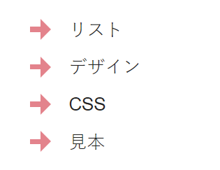
.list201 ul {
  padding: 0.3em 0.5em;
  list-style-type: none;
  border: none;
}
.list201 ul li {
  position:relative;
  padding: 0.3em 0 0.3em 2.5em;
  line-height: 1.5;
}
.list201 ul li:before {
  position: absolute;
  content:'';
  height:0;
  width:0;
  border:10px transparent solid;
  border-right-width:0;
  border-left-color:#ee8992;
  left:16px;
  top: 7.5px;
}
.list201 ul li:after {
  position: absolute;
  content:'';
  height:5px;
  width:10px;
  background:#ee8992;
  left: 6px;
  top: 15px;
}
3.【ulのみ使用可】チェックリスト
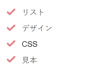
.list202 ul {
  padding: 0.5em 0;
  list-style-type: none;
  border: none;
}
.list202 ul li {
  position:relative;
  padding: 0.3em 0 0.3em 2em;
  line-height: 1.5;
}
.list202 ul li:after, .list202 ul li:before{
  content:'';
  position:absolute;
  top: 7px;
  left: 11px;
  height: 18px;
  width:4px;
  background:#ee8992;
  border-radius:10px;
  transform:rotate(45deg);
  -webkit-transform:rotate(45deg);
  -o-transform:rotate(45deg);
}
.list202 ul li:after {
  top: 14px;
  left: 3px;
  height: 10px;
  transform:rotate(-45deg);
  -webkit-transform:rotate(-45deg);
  -o-transform:rotate(-45deg);
}
4.【ulのみ使用可】チェックリスト(アイコンフォント使用)
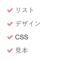
.list203 ul {
  padding: 0.5em 0;
  list-style-type: none;
  border: none;
}
.list203 ul li {
  position:relative;
  padding: 0.3em 0 0.3em 1.5em;
  line-height: 1.5;
}
.list203 ul li:before{
  position: absolute;
  left: 0.2em;
  color: #ee8992;
  font-family: FontAwesome;
  content: "\f00c";
}
5.【ulのみ使用可】丸のリスト
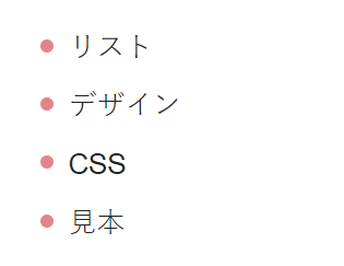
.list204 ul {
  padding: 0.3em 0;
  list-style-type: none;
  border: none;
}
.list204 ul li {
  position:relative;
  padding: 0.3em 0 0.3em 1.6em;
  line-height: 1.5;
}
.list204 ul li:before{
  content: '';
  position: absolute;
  background-color: #ee8992;
  width: 8px;
  height: 8px;
  border-radius: 50%;
  left: 10px;
  top: 13px;
}
6.【ulのみ使用可】丸のリスト2
.list205 ul {
  padding: 0.3em 0;
  list-style-type: none;
  border: none;
}
.list205 ul li {
  position:relative;
  padding: 0.3em 0 0.3em 1.6em;
  line-height: 1.5;
}
.list205 ul li:before{
  content: '';
  position: absolute;
  background-color: #fff;
  border: 1px solid #ee8992;
  width: 8px;
  height: 8px;
  border-radius: 50%;
  left: 10px;
  top: 13px;
}
7.【ulのみ使用可】矢印と丸のリスト
.list206 ul {
  padding: 0.3em 0;
  list-style-type: none;
  border: none;
}
.list206 ul li {
  position:relative;
  padding: 0.3em 0 0.3em 1.4em;
  line-height: 1.5;
}
.list206 ul li::after,
.list206 ul li::before {
  content: '';
  position: absolute;
}
.list206 ul li::after {
  left: -0.2em;
  top: 8px;
  width: 20px;
  height: 20px;
  background-color: #ee8992;
  border-radius: 50%;
}
.list206 ul li::before {
  z-index: 2;
  left: 3px;
  top: 15px;
  width: 4px;
  height: 4px;
  border-right: 1px solid #fff;
  border-bottom: 1px solid #fff;
  -webkit-transform: rotate(-45deg);
  transform: rotate(-45deg);
}
8.【ulのみ使用可】タグのリスト
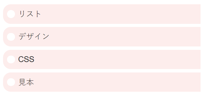
.list208 ul{
  padding: 0.3em 0.5em;
  list-style-type: none;
  border: none;
}
.list208 ul li {
  padding: 0.5em 0.5em 0.5em 0.5em;
  margin: 0 0 7px 0;
  line-height: 1.5;
  background: #ffefef;
  vertical-align: middle;
  border-radius: 17px 0px 0px 17px;
}
.list208 ul li:before{
  display:inline-block;
  vertical-align: middle;
  content:'';
  width:1em;
  height: 1em;
  background: #fff;
  border-radius: 50%;
  margin: 0 7px 3px 0;
}
9.【olのみ使用可】番号と丸のリスト
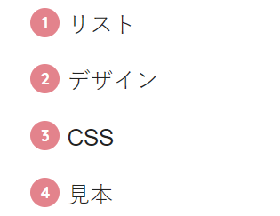
.list207 ol {
  padding: 0.3em 0.5em;
  list-style-type: none;
  border: none;
  counter-reset: number;
}
.list207 ol li {
  position: relative;
  line-height: 1.5;
  padding: 0.5em 0 0.5em 1.6em;
}
.list207 ol li:before {
  position: absolute;
  font-family: "Quicksand", sans-serif;
  content: counter(number);
  counter-increment: number;
  left: 0;
  width: 22px;
  height: 22px;
  border-radius: 50%;
  background: #ee8992;
  color: white;
  font-size: 12px;
  font-weight: bold;
  text-align: center;
  vertical-align: middle;
  line-height: 22px;
}
10.【olのみ使用可】ボックス風のリスト
.list209 ol{
  padding: 0;
  list-style-type: none;
  border: none;
  counter-reset: number;
}
.list209 ol li{
  position:relative;
  padding:0 0 0 50px;
  background: #fff5ee;
  border: 2px solid #ffb3cc;
  border-radius: 2px;
  margin: 0 0 5px -15px;
}
.list209 ol li:after{
  content: counter(number);
  counter-increment: number;
  position: absolute;
  left: 0px;
  top: 0px;
  background: #ffb3cc;
  height: 32px;
  width: 32px;
  line-height: 32px;
  text-align: center;
  font-weight: bold;
}
.list209 ol li:before{
  content:'';
  display:block;
  position:absolute;
  box-shadow: 0 0 2px 2px rgba(255,255,255,0.2) inset;
  top: 6px;
  left: 30px;
  height:0;
  width:0;
  border-top: 10px solid transparent;
  border-right: 9px solid transparent;
  border-bottom: 10px solid transparent;
  border-left: 15px solid #ffb3cc;
}
11.【olのみ使用可】数字のリスト
.list210 ol {
  padding: 0.3em 0.5em;
  list-style-type: none;
  border: none;
  counter-reset: number;
}
.list210 ol li {
  position: relative;
  line-height: 1.5;
  padding: 0.5em 0 0.5em 1.6em;
}
.list210 ol li:before {
  position: absolute;
  font-style: italic;
  font-family:'Goudy Bookletter 1911',Georgia,serif;
  content: counter(number)".";
  counter-increment: number;
  left: 0;
  top: 0;
  font-weight: bold;
  font-size: 1.4em;
}
【オススメツールをちょっと紹介】
複数のASPを一括で管理する無料のツール
案件の報酬額を比較できるので、1番条件の良いASPを簡単に見つけることが出来ます!
【共通・タイトルなし】リストデザインのCSSサンプル
みっぴー
共通・タイトルなしのHTMLの書き方
下記で紹介する「リストデザインのCSSサンプル」の使い方についてですが、基本的には下記のHTMLを記事内に記入することでデザインが反映されます。
タイトルなしのCSSを反映させるHTMLの基本的な書き方は下記の通りです。
箇条書き(ul)
<div class="list1">
<ul>
<li>リスト</li>
<li>デザイン</li>
<li>CSS</li>
<li>見本</li>
</ul>
</div>
番号付きの箇条書き(ol)
<div class="list1">
<ol>
<li>リスト</li>
<li>デザイン</li>
<li>CSS</li>
<li>見本</li>
</ol>
</div><div class="list1">「list1」の部分を下記に紹介しているCSSのclass名に変えて使ってくださいね。
1.シンプルなデザイン
箇条書き(ul)
番号付きの箇条書き(ol)
.list1 ul,.list1 ol{
  color: #ee8992;
  border: 3px solid #ffccd2;
  background: #fffafa;
  padding: 0.5em 0.5em 0.5em 2em;
}
.list1 ul li, .list1 ol li {
  line-height: 1.5;
  padding: 0.5em 0;
}
2.水玉模様のリスト
箇条書き(ul)
番号付きの箇条書き(ol)
.list17 ul,.list17 ol{
  border: 3px solid #ffccd2;
  background-color: #fff9fc;
  background-image: radial-gradient(#fff4f9 35%, transparent 0), radial-gradient(#fff4f9 35%, transparent 0);
  background-position: 0 0, 40px 40px;
  background-size: 80px 80px;
  color: #ee8992;
  padding: 0.5em 0.5em 0.5em 2em;
  margin: 2em 0;
  font-weight: bold;
}
.list17 ul li, .list17 ol li {
  line-height: 1.5;
  padding: 0.5em 0;
}
3.水玉模様のリスト
箇条書き(ul)
番号付きの箇条書き(ol)
.list18 ul,.list18 ol{
  border: 3px solid #ffccd2;
  background-color: #fff;
  background-image: radial-gradient(#fff4f9 50%, transparent 0), radial-gradient(#fff4f9 50%, transparent 0);
  background-position: 0 0, 20px 20px;
  background-size: 40px 40px;
  color: #ee8992;
  padding: 0.5em 0.5em 0.5em 2em;
  margin: 2em 0;
  font-weight: bold;
}
.list18 ul li, .list18 ol li {
  line-height: 1.5;
  padding: 0.5em 0;
}
4.水玉模様のリスト
箇条書き(ul)
番号付きの箇条書き(ol)
.list19 ul,.list19 ol{
  border: 3px solid #ffccd2;
  background-color: #ffe6ea;
  background-image: radial-gradient(#fff4f9 50%, transparent 0), radial-gradient(#fff4f9 50%, transparent 0);
  background-position: 0 0, 20px 20px;
  background-size: 40px 40px;
  color: #ee8992;
  padding: 0.5em 0.5em 0.5em 2em;
  margin: 2em 0;
  font-weight: bold;
}
.list19 ul li, .list19 ol li {
  line-height: 1.5;
  padding: 0.5em 0;
}
5.ストライプのリスト
箇条書き(ul)
番号付きの箇条書き(ol)
.list20 ul,.list20 ol{
  border: 3px solid #ffefef;
  background: repeating-linear-gradient(-45deg, #fef4f4, #fef4f4 3px,#ffefef 3px, #ffefef 7px);
  color: #ee8992;
  padding: 0.5em 0.5em 0.5em 2em;
  margin: 2em 0;
  font-weight: bold;
}
.list20 ul li, .list20 ol li {
  line-height: 1.5;
  padding: 0.5em 0;
}
6.ストライプのリスト
箇条書き(ul)
番号付きの箇条書き(ol)
.list21 ul,.list21 ol{
  border: 3px solid #ffefef;
  background: repeating-linear-gradient(-45deg, #fef4f4, #fef4f4 14px,#ffefef 14px, #ffefef 20px);
  color: #ee8992;
  padding: 0.5em 0.5em 0.5em 2em;
  margin: 2em 0;
  font-weight: bold;
}
.list21 ul li, .list21 ol li {
  line-height: 1.5;
  padding: 0.5em 0;
}
7.チェック柄のリスト
箇条書き(ul)
番号付きの箇条書き(ol)
.list22 ul,.list22 ol{
  border: 3px solid #FFE7E7;
  background-color: #fff;
  background-image:
  linear-gradient(-45deg, rgba(255,224,224,.5) 25%, transparent 25%, transparent 50%, rgba(255,224,224,.5) 50%, rgba(255,224,224,.5) 75%, transparent 75%, transparent 100%),
  linear-gradient(45deg, rgba(255,224,224,.5) 25%, transparent 25%, transparent 50%, rgba(255,224,224,.5) 50%, rgba(255,224,224,.5) 75%, transparent 75%, transparent 100%);
  background-size: 45px 45px;
  color: #ee8992;
  padding: 0.5em 0.5em 0.5em 2em;
  margin: 2em 0;
  font-weight: bold;
}
.list22 ul li, .list22 ol li {
  line-height: 1.5;
  padding: 0.5em 0;
}
8.チェック柄のリスト
箇条書き(ul)
番号付きの箇条書き(ol)
.list23 ul,.list23 ol{
  border: 3px solid #FFE7E7;
  background-color: #fff;
  background-image:
  linear-gradient(-45deg, rgba(255,224,224,.5) 25%, transparent 25%, transparent 50%, rgba(255,224,224,.5) 50%, rgba(255,224,224,.5) 75%, transparent 75%, transparent 100%),
  linear-gradient(45deg, rgba(255,224,224,.5) 25%, transparent 25%, transparent 50%, rgba(255,224,224,.5) 50%, rgba(255,224,224,.5) 75%, transparent 75%, transparent 100%);
  background-size: 90px 90px;
  color: #ee8992;
  padding: 0.5em 0.5em 0.5em 2em;
  margin: 2em 0;
  font-weight: bold;
}
.list23 ul li, .list23 ol li {
  line-height: 1.5;
  padding: 0.5em 0;
}
9.チェック柄のリスト
箇条書き(ul)
番号付きの箇条書き(ol)
.list24 ul,.list24 ol{
  border: 3px solid #FFE7E7;
  background-color: #fff;
  background-image:
  linear-gradient(90deg, rgba(255,224,224,.5) 25%, transparent 25%, transparent 50%, rgba(255,224,224,.5) 50%, rgba(255,224,224,.5) 75%, transparent 75%, transparent 100%),
  linear-gradient(180deg, rgba(255,224,224,.5) 25%, transparent 25%, transparent 50%, rgba(255,224,224,.5) 50%, rgba(255,224,224,.5) 75%, transparent 75%, transparent 100%);
  background-size: 45px 45px;
  color: #ee8992;
  padding: 0.5em 0.5em 0.5em 2em;
  margin: 2em 0;
  font-weight: bold;
}
.list24 ul li, .list24 ol li {
  line-height: 1.5;
  padding: 0.5em 0;
}
10.区切り線をつけたノートのようなデザイン
箇条書き(ul)
番号付きの箇条書き(ol)
.list2 ul,.list2 ol {
  border: solid 2px #ee8992;
  padding: 0.3em 0.5em;
  position: relative;
  color: #ee8992;
  list-style-type: none;
}
.list2 ol {
  counter-reset: number;
}
.list2 ul li,.list2 ol li {
  line-height: 1.5;
  padding: 0.5em 0 0.5em 1.4em;
  border-bottom: dashed 1px #ee8992;
}
.list2 ul li:before {
  position: absolute;
  font-family: FontAwesome;
  content: "\f14a";
  left : 0.5em;
  color: #ee8992;
}
.list2 ol li:before {
  display: inline-block;
  position: absolute;
  font-family: "Quicksand", sans-serif;
  content: counter(number);
  counter-increment: number;
  left: 0.5em;
  width: 22px;
  height: 22px;
  border-radius: 20%;
  background: #ee8992;
  color: white;
  font-size: 12px;
  font-weight: bold;
  text-align: center;
  vertical-align: middle;
  line-height: 22px;
}
.list2 ul li:last-of-type,.list2 ol li:last-of-type{
  border-bottom: none;
}
11.水玉模様のノート
箇条書き(ul)
番号付きの箇条書き(ol)
.list25 ul,.list25 ol {
  border: solid 2px #ee8992;
  padding: 0.3em 0.5em;
  position: relative;
  color: #ee8992;
  list-style-type: none;
   background-color: #fff9fc;
  background-image: radial-gradient(#fff4f9 35%, transparent 0), radial-gradient(#fff4f9 35%, transparent 0);
  background-position: 0 0, 40px 40px;
  background-size: 80px 80px;
}
.list25 ol {
  counter-reset: number;
}
.list25 ul li,.list25 ol li {
  line-height: 1.5;
  padding: 0.5em 0 0.5em 1.4em;
  border-bottom: dashed 1px #ee8992;
}
.list25 ul li:before {
  position: absolute;
  font-family: FontAwesome;
  content: "\f14a";
  left : 0.5em;
  color: #ee8992;
}
.list25 ol li:before {
  display: inline-block;
  position: absolute;
  font-family: "Quicksand", sans-serif;
  content: counter(number);
  counter-increment: number;
  left: 0.5em;
  width: 22px;
  height: 22px;
  border-radius: 20%;
  background: #ee8992;
  color: white;
  font-size: 12px;
  font-weight: bold;
  text-align: center;
  vertical-align: middle;
  line-height: 22px;
}
.list25 ul li:last-of-type,.list25 ol li:last-of-type{
  border-bottom: none;
}
12.ストライプのノート
箇条書き(ul)
番号付きの箇条書き(ol)
.list26 ul,.list26 ol {
  border: solid 2px #ee8992;
  padding: 0.3em 0.5em;
  position: relative;
  color: #ee8992;
  list-style-type: none;
  background: repeating-linear-gradient(-45deg, #fef4f4, #fef4f4 3px,#ffefef 3px, #ffefef 7px);
  background-size: 80px 80px;
}
.list26 ol {
  counter-reset: number;
}
.list26 ul li,.list26 ol li {
  line-height: 1.5;
  padding: 0.5em 0 0.5em 1.4em;
  border-bottom: dashed 1px #ee8992;
}
.list26 ul li:before {
  position: absolute;
  font-family: FontAwesome;
  content: "\f14a";
  left : 0.5em;
  color: #ee8992;
}
.list26 ol li:before {
  display: inline-block;
  position: absolute;
  font-family: "Quicksand", sans-serif;
  content: counter(number);
  counter-increment: number;
  left: 0.5em;
  width: 22px;
  height: 22px;
  border-radius: 20%;
  background: #ee8992;
  color: white;
  font-size: 12px;
  font-weight: bold;
  text-align: center;
  vertical-align: middle;
  line-height: 22px;
}
.list26 ul li:last-of-type,.list26 ol li:last-of-type{
  border-bottom: none;
}
13.チェック柄のノート
箇条書き(ul)
番号付きの箇条書き(ol)
.list27 ul,.list27 ol {
  border: solid 2px #ee8992;
  padding: 0.3em 0.5em;
  position: relative;
  color: #ee8992;
  list-style-type: none;
  background-color: #fff;
  background-image:
  linear-gradient(-45deg, rgba(255,224,224,.5) 25%, transparent 25%, transparent 50%, rgba(255,224,224,.5) 50%, rgba(255,224,224,.5) 75%, transparent 75%, transparent 100%),
  linear-gradient(45deg, rgba(255,224,224,.5) 25%, transparent 25%, transparent 50%, rgba(255,224,224,.5) 50%, rgba(255,224,224,.5) 75%, transparent 75%, transparent 100%);
  background-size: 45px 45px;
  background-size: 80px 80px;
}
.list27 ol {
  counter-reset: number;
}
.list27 ul li,.list27 ol li {
  line-height: 1.5;
  padding: 0.5em 0 0.5em 1.4em;
  border-bottom: dashed 1px #ee8992;
}
.list27 ul li:before {
  position: absolute;
  font-family: FontAwesome;
  content: "\f14a";
  left : 0.5em;
  color: #ee8992;
}
.list27 ol li:before {
  display: inline-block;
  position: absolute;
  font-family: "Quicksand", sans-serif;
  content: counter(number);
  counter-increment: number;
  left: 0.5em;
  width: 22px;
  height: 22px;
  border-radius: 20%;
  background: #ee8992;
  color: white;
  font-size: 12px;
  font-weight: bold;
  text-align: center;
  vertical-align: middle;
  line-height: 22px;
}
.list27 ul li:last-of-type,.list27 ol li:last-of-type{
  border-bottom: none;
}
14.区切り線をつけたノートのようなデザインの色違い
箇条書き(ul)
番号付きの箇条書き(ol)
.list3 ul,.list3 ol{
position: relative;
border: solid 2px #fcb1b1;
border-radius: 7px;
background: #fff6e6;
color: #fcb1b1;
list-style-type: none;
padding: 0;
}
.list3 ol{
counter-reset: number;
}
.list3 ul li,.list3 ol li {
line-height: 1.5;
padding: 0.5em 0.5em 0.5em 2em;
border-bottom: dashed 1px #fcb1b1;
font-weight: bold;
}
.list3 ul li:before {
position: absolute;
font-family: FontAwesome;
content: "\f14a";
left : 0.5em;
color: #fcb1b1;
}
.list3 ol li:before {
display: inline-block;
position: absolute;
font-family: "Quicksand", sans-serif;
content: counter(number);
counter-increment: number;
left: 0.5em;
width: 22px;
height: 22px;
border-radius: 20%;
background: #fcb1b1;
color: white;
font-size: 12px;
font-weight: bold;
text-align: center;
vertical-align: middle;
line-height: 22px;
}
.list3 ul li:last-of-type,.list3 ol li:last-of-type{
border-bottom: none;
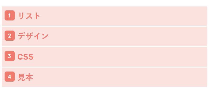
}15.白線で区切ったデザイン
箇条書き(ul)
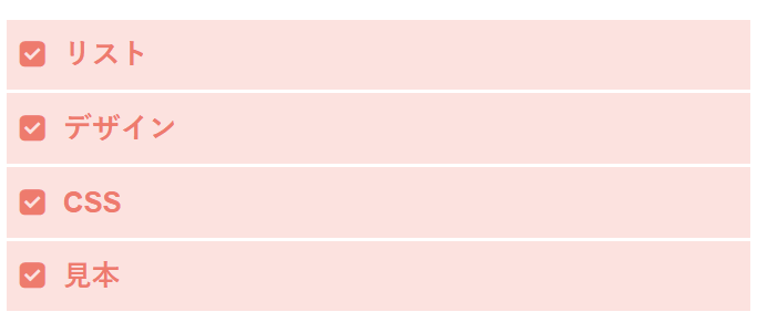
番号付きの箇条書き(ol)
.list4 ul,.list4 ol {
padding: 0;
position: relative;
border: none;
}
.list4 ol {
counter-reset: number;
}
.list4 ul li,.list4 ol li {
color: #fa8072;
background: #ffe4e1;
line-height: 1.5;
padding: 0.5em 0.5em 0.5em 2em;
border-bottom: 2px solid #fff;
list-style-type: none;
font-weight: bold;
}
.list4 ul li:before {
font-family: FontAwesome;
content: "\f14a";
position: absolute;
left : 0.5em;
color: #fa8072;
}
.list4 ol li:before {
display: inline-block;
position: absolute;
font-family: "Quicksand", sans-serif;
content: counter(number);
counter-increment: number;
left: 0.5em;
width: 22px;
height: 22px;
border-radius: 20%;
background: #fa8072;
color: white;
font-size: 12px;
font-weight: bold;
text-align: center;
vertical-align: middle;
line-height: 22px;
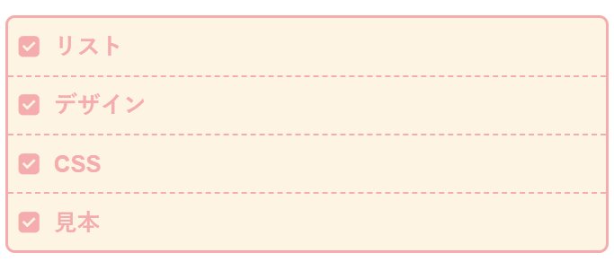
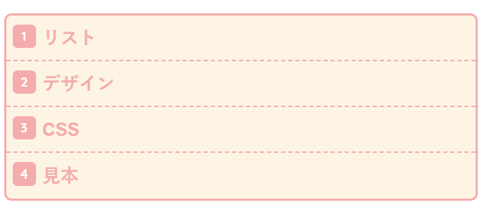
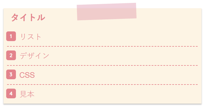
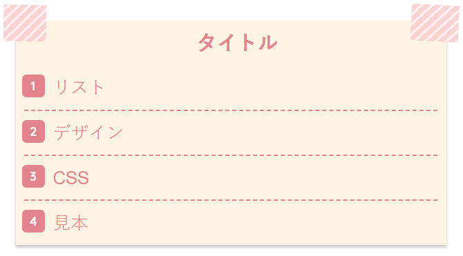
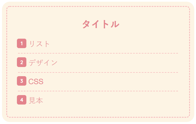
}16.固定のタイトル付きリストデザイン
箇条書き(ul)
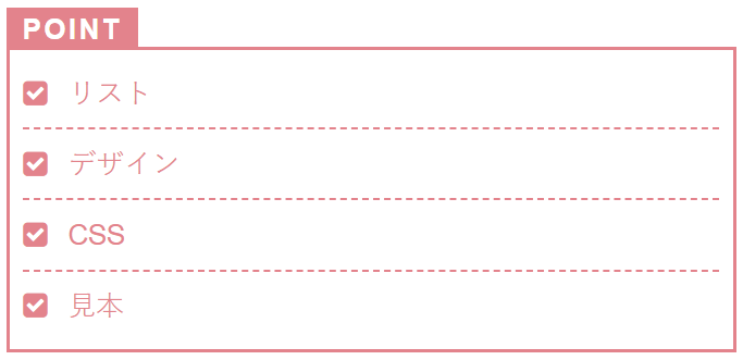
番号付きの箇条書き(ol)
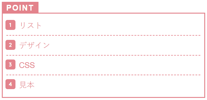
.list5 ul,.list5 ol {
  margin: 3em 0 1em 0;
  border: solid 2px #ee8992;
  padding: 0.3em 0.5em;
  position: relative;
  color: #ee8992;
  list-style-type: none;
}
.list5 ol {
  counter-reset: number;
}
.list5 ul li,.list5 ol li {
  line-height: 1.5;
  padding: 0.5em 0 0.5em 1.6em;
  border-bottom: dashed 1px #ee8992;
}
.list5 ul li:before {
  position: absolute;
  font-family: FontAwesome;
  content: "\f14a";
  left : 0.5em;
  color: #ee8992;
}
.list5 ol li:before {
  display: inline-block;
  position: absolute;
  font-family: "Quicksand", sans-serif;
  content: counter(number);
  counter-increment: number;
  left: 0.5em;
  width: 22px;
  height: 22px;
  border-radius: 20%;
  background: #ee8992;
  color: white;
  font-size: 12px;
  font-weight: bold;
  text-align: center;
  vertical-align: middle;
  line-height: 22px;
}
.list5 ul li:after,.list5 ol li:after{
  background: #ee8992;
  color: #fff;
  font-weight: bold;
  position: absolute;
  left: -2px;
  bottom: 100%;
  padding: 1px 10px 0 10px;
  content: "POINT";
  letter-spacing: 0.1em;
}
.list5 ul li:last-of-type,.list5 ol li:last-of-type{
  border-bottom: none;
}固定でタイトルを指定したい場合は、こちらを使ってください。
もちろん「POINT」の部分は、お好きな文字に変更可能です。
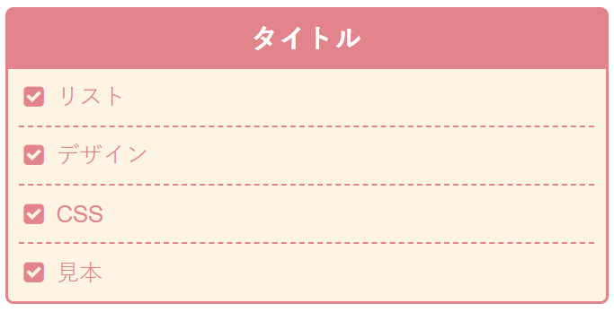
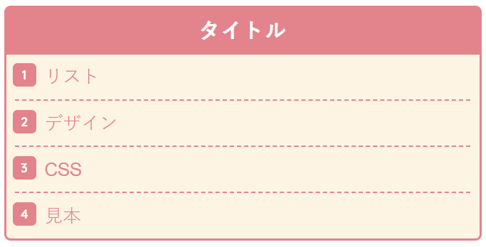
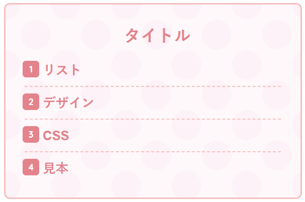
【共通・タイトルあり】リストデザインのCSSサンプル
みっぴー
タイトルは、その都度好きなものに変更可能です!
共通・タイトルありのHTMLの書き方
箇条書き(ul)
<div class="list1">
<div class="list1-title">タイトル</div>
<ul>
<li>リスト</li>
<li>デザイン</li>
<li>CSS</li>
<li>見本</li>
</ul>
</div>
番号付きの箇条書き(ol)
<div class="list1">
<div class="list1-title">タイトル</div>
<ol>
<li>リスト</li>
<li>デザイン</li>
<li>CSS</li>
<li>見本</li>
</ol>
</div><div class="list1">「list1」の部分を下記に紹介しているCSSのclass名に変えて使ってくださいね。
<div class="list1-title">「list1-title」の部分を下記に紹介しているCSSのclass名に変えて使ってくださいね。
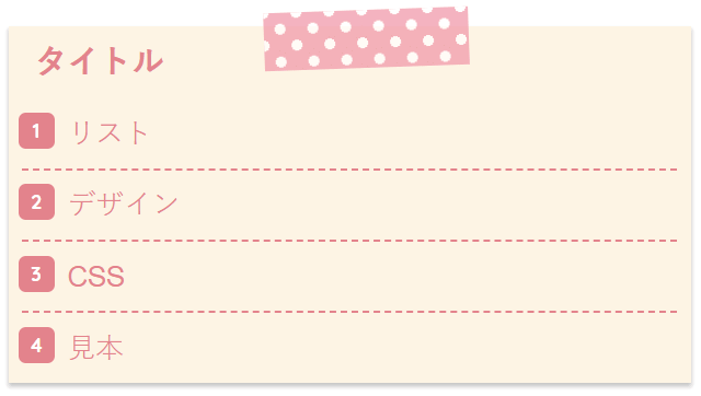
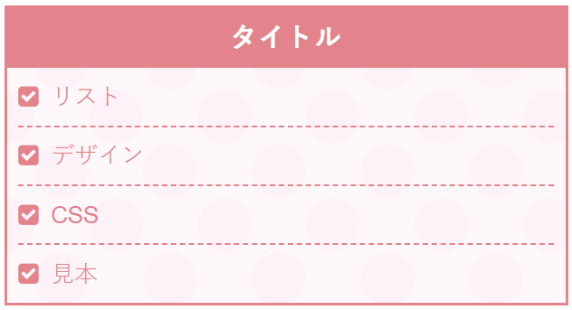
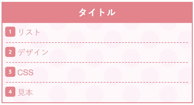
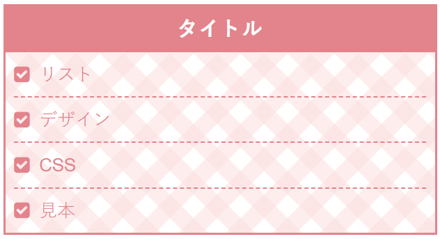
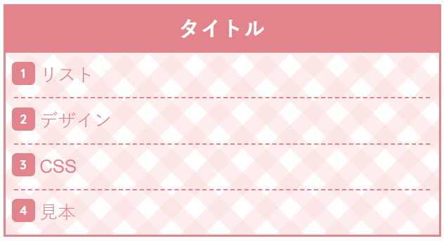
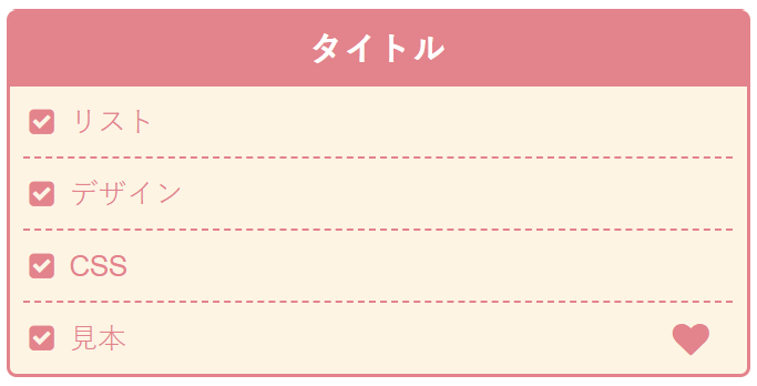
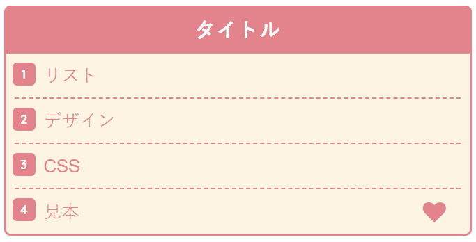
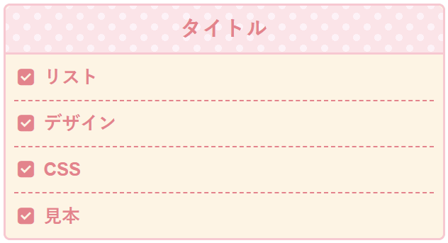
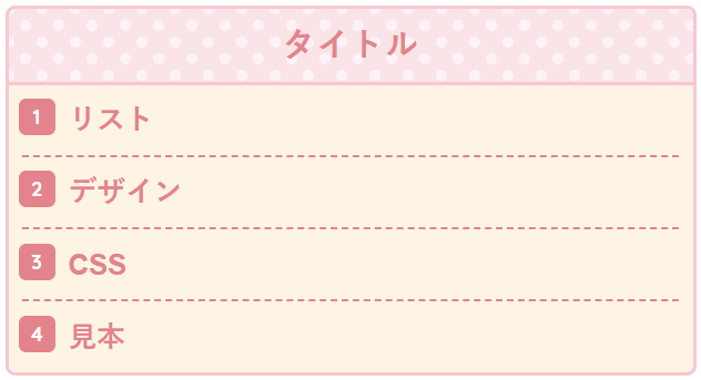
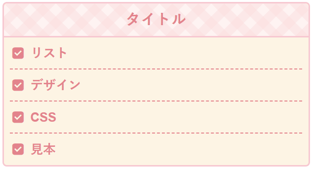
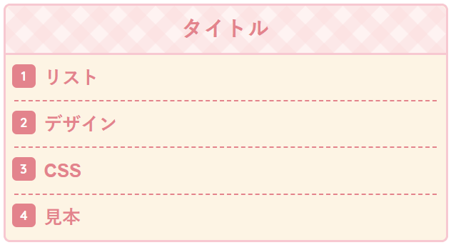
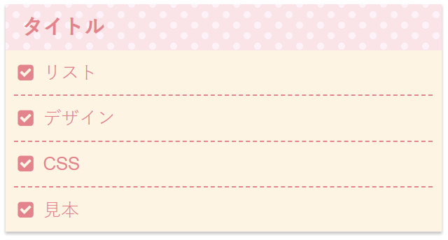
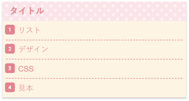
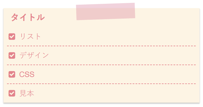
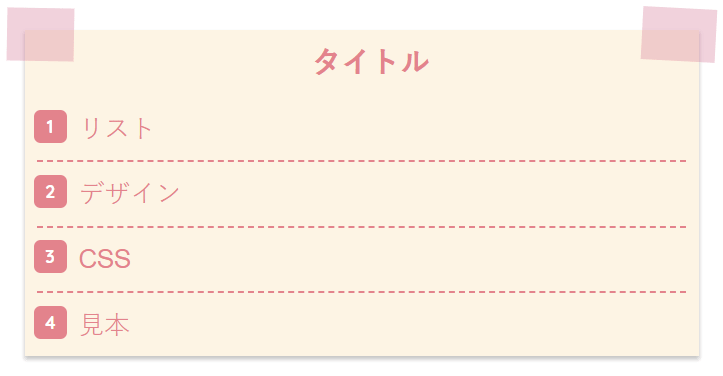
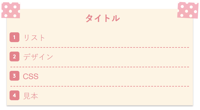
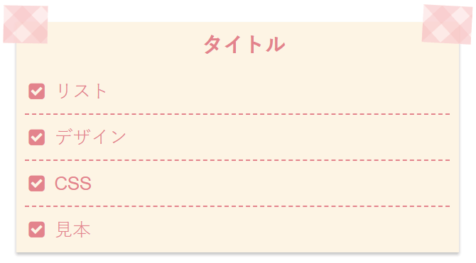
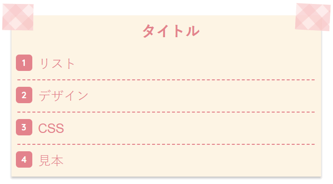
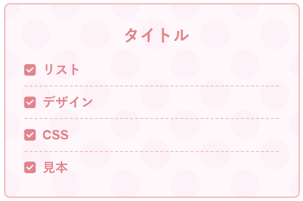
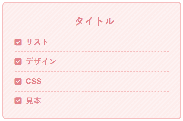
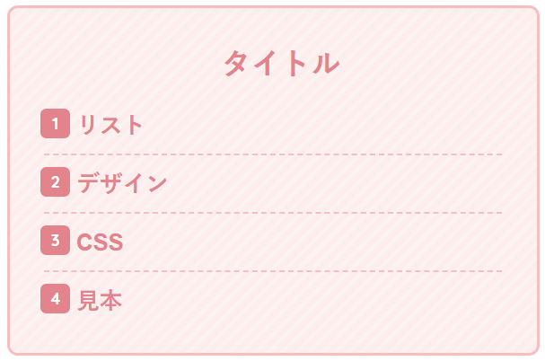
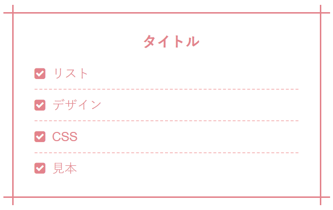
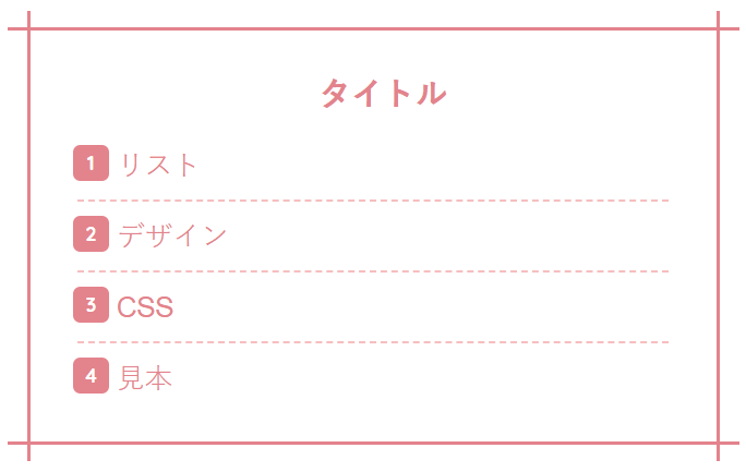
17.メモ帳のようなリストデザイン
箇条書き(ul)
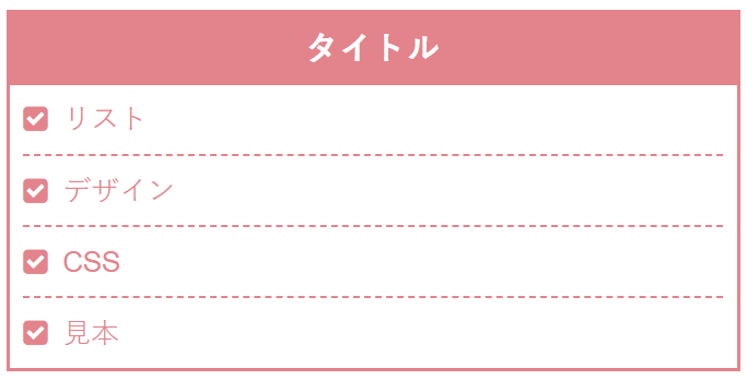
番号付きの箇条書き(ol)
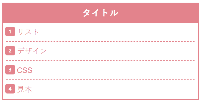
.list6 {
position: relative;
border: solid 2px #ee8992;
margin: 3em 0 1em 0;
}
.list6-title {
font-size: 1.15em;
background: #ee8992;
padding: 4px;
text-align: center;
color: #FFF;
font-weight: bold;
letter-spacing: 0.05em;
}
.list6 ul,.list6 ol {
margin: 0;
padding: 0 0.5em 0 0.5em;
color: #ee8992;
border: none;
list-style-type: none;
}
.list6 ol{
counter-reset: number;
}
.list6 ul li,.list6 ol li {
line-height: 1.5;
padding: 0.5em 0 0.5em 1.4em;
border-bottom: dashed 1px #ee8992;
}
.list6 ul li:before {
position: absolute;
font-family: FontAwesome;
content: "\f14a";
left : 0.5em;
color: #ee8992;
}
.list6 ol li:before {
display: inline-block;
position: absolute;
font-family: "Quicksand", sans-serif;
content: counter(number);
counter-increment: number;
left: 0.5em;
width: 22px;
height: 22px;
border-radius: 20%;
background: #ee8992;
color: white;
font-size: 12px;
font-weight: bold;
text-align: center;
vertical-align: middle;
line-height: 22px;
}
.list6 ul li:last-of-type,.list6 ol li:last-of-type{
border-bottom: none;
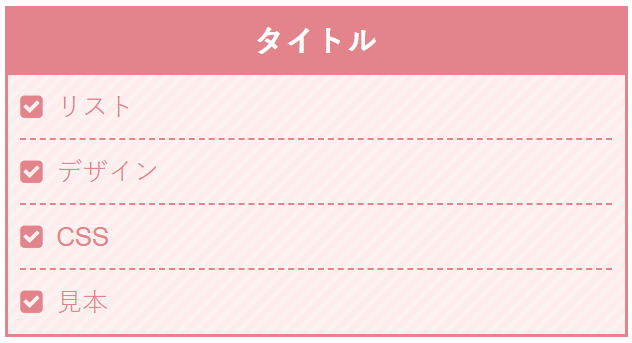
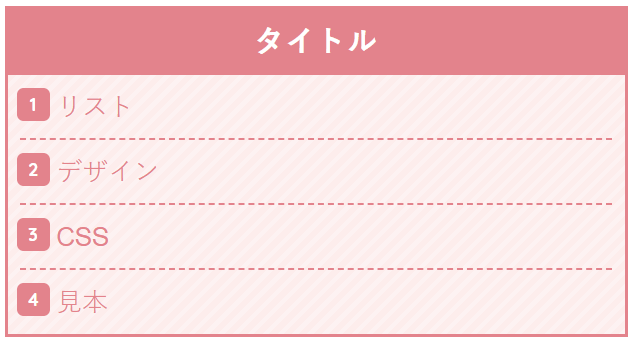
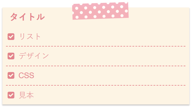
}18.水玉模様のノート
箇条書き(ul)
番号付きの箇条書き(ol)
.list28 {
position: relative;
border: solid 2px #ee8992;
margin: 3em 0 1em 0;
background-color: #fff9fc;
background-image: radial-gradient(#fff4f9 35%, transparent 0), radial-gradient(#fff4f9 35%, transparent 0);
background-position: 0 0, 40px 40px;
background-size: 80px 80px;
}
.list28-title {
font-size: 1.15em;
background: #ee8992;
padding: 4px;
text-align: center;
color: #FFF;
font-weight: bold;
letter-spacing: 0.05em;
}
.list28 ul,.list28 ol {
margin: 0;
padding: 0 0.5em 0 0.5em;
color: #ee8992;
border: none;
list-style-type: none;
}
.list28 ol{
counter-reset: number;
}
.list28 ul li,.list28 ol li {
line-height: 1.5;
padding: 0.5em 0 0.5em 1.4em;
border-bottom: dashed 1px #ee8992;
}
.list28 ul li:before {
position: absolute;
font-family: FontAwesome;
content: "\f14a";
left : 0.5em;
color: #ee8992;
}
.list28 ol li:before {
display: inline-block;
position: absolute;
font-family: "Quicksand", sans-serif;
content: counter(number);
counter-increment: number;
left: 0.5em;
width: 22px;
height: 22px;
border-radius: 20%;
background: #ee8992;
color: white;
font-size: 12px;
font-weight: bold;
text-align: center;
vertical-align: middle;
line-height: 22px;
}
.list28 ul li:last-of-type,.list28 ol li:last-of-type{
border-bottom: none;
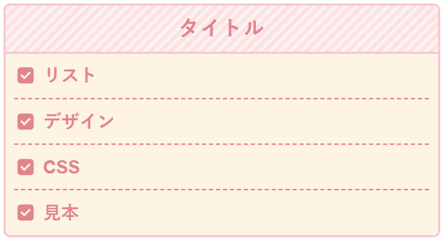
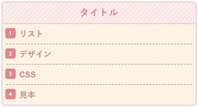
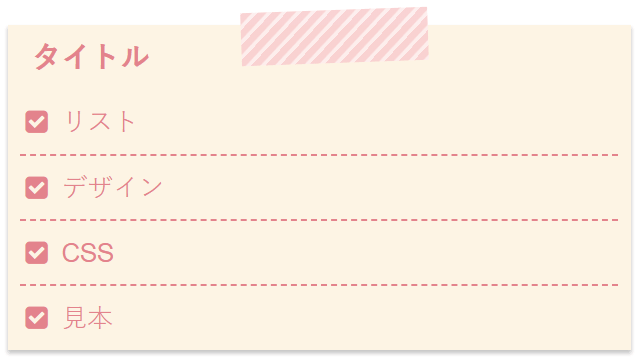
}19.ストライプのノート
箇条書き(ul)
番号付きの箇条書き(ol)
.list29 {
  position: relative;
  border: solid 2px #ee8992;
  margin: 3em 0 1em 0;
  background: repeating-linear-gradient(-45deg, #fef4f4, #fef4f4 3px,#ffefef 3px, #ffefef 7px);
}
.list29-title {
  font-size: 1.15em;
  background: #ee8992;
  padding: 4px;
  text-align: center;
  color: #FFF;
  font-weight: bold;
  letter-spacing: 0.05em;
}
.list29 ul,.list29 ol {
  margin: 0;
  padding: 0 0.5em 0 0.5em;
  color: #ee8992;
  border: none;
  list-style-type: none;
}
 .list29 ol{
  counter-reset: number;
}
.list29 ul li,.list29 ol li {
  line-height: 1.5;
  padding: 0.5em 0 0.5em 1.4em;
  border-bottom: dashed 1px #ee8992;
}
.list29 ul li:before {
  position: absolute;
  font-family: FontAwesome;
  content: "\f14a";
  left : 0.5em;
  color: #ee8992;
}
.list29 ol li:before {
  display: inline-block;
  position: absolute;
  font-family: "Quicksand", sans-serif;
  content: counter(number);
  counter-increment: number;
  left: 0.5em;
  width: 22px;
  height: 22px;
  border-radius: 20%;
  background: #ee8992;
  color: white;
  font-size: 12px;
  font-weight: bold;
  text-align: center;
  vertical-align: middle;
  line-height: 22px;
}
.list29 ul li:last-of-type,.list29 ol li:last-of-type{
  border-bottom: none;
}
20.チェック柄のノート
箇条書き(ul)
番号付きの箇条書き(ol)
.list30 {
position: relative;
border: solid 2px #ee8992;
margin: 3em 0 1em 0;
background-color: #fff;
background-image:
linear-gradient(-45deg, rgba(255,224,224,.5) 25%, transparent 25%, transparent 50%, rgba(255,224,224,.5) 50%, rgba(255,224,224,.5) 75%, transparent 75%, transparent 100%),
linear-gradient(45deg, rgba(255,224,224,.5) 25%, transparent 25%, transparent 50%, rgba(255,224,224,.5) 50%, rgba(255,224,224,.5) 75%, transparent 75%, transparent 100%);
background-size: 45px 45px;
}
.list30-title {
font-size: 1.15em;
background: #ee8992;
padding: 4px;
text-align: center;
color: #FFF;
font-weight: bold;
letter-spacing: 0.05em;
}
.list30 ul,.list30 ol {
margin: 0;
padding: 0 0.5em 0 0.5em;
color: #ee8992;
border: none;
list-style-type: none;
}
.list30 ol{
counter-reset: number;
}
.list30 ul li,.list30 ol li {
line-height: 1.5;
padding: 0.5em 0 0.5em 1.4em;
border-bottom: dashed 1px #ee8992;
}
.list30 ul li:before {
position: absolute;
font-family: FontAwesome;
content: "\f14a";
left : 0.5em;
color: #ee8992;
}
.list30 ol li:before {
display: inline-block;
position: absolute;
font-family: "Quicksand", sans-serif;
content: counter(number);
counter-increment: number;
left: 0.5em;
width: 22px;
height: 22px;
border-radius: 20%;
background: #ee8992;
color: white;
font-size: 12px;
font-weight: bold;
text-align: center;
vertical-align: middle;
line-height: 22px;
}
.list30 ul li:last-of-type,.list30 ol li:last-of-type{
border-bottom: none;
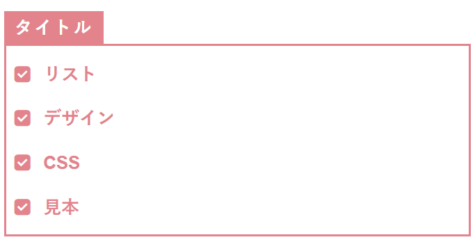
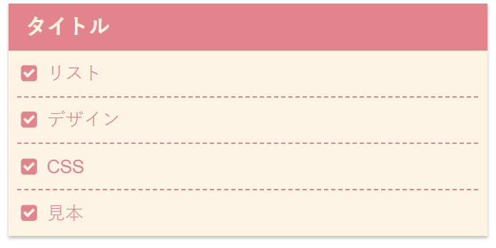
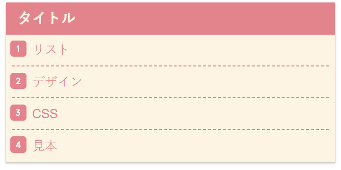
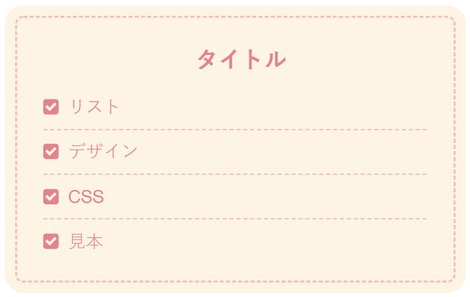
}21.区切り線なしのシンプルなタイトル付きデザイン
箇条書き(ul)
番号付きの箇条書き(ol)
.list7 {
margin: 3em 0 1em 0;
}
.list7-title {
display: inline-block;
padding: 1px 10px 0 10px;
background: #ee8992;
color: #fff;
letter-spacing: 0.1em;
font-weight: bold;
}
.list7 ul,.list7 ol {
margin: 0;
padding: 5px;
position: relative;
border: solid 2px #ee8992;
}
.list7 ol {
counter-reset: number;
}
.list7 ul li,.list7 ol li {
color: #ee8992;
line-height: 1.5;
padding: 0.5em 0.5em 0.5em 1.8em;
list-style-type: none;
font-weight: bold;
}
.list7 ul li:before {
font-family: FontAwesome;
content: "\f14a";
position: absolute;
left : 0.5em;
color: #ee8992;
}
.list7 ol li:before {
display: inline-block;
position: absolute;
left: 0.5em;
width: 22px;
height: 22px;
border-radius: 20%;
background: #ee8992;
color: white;
font-family: "Quicksand", sans-serif;
font-size: 12px;
font-weight: bold;
text-align: center;
vertical-align: middle;
line-height: 22px;
content: counter(number);
counter-increment: number;
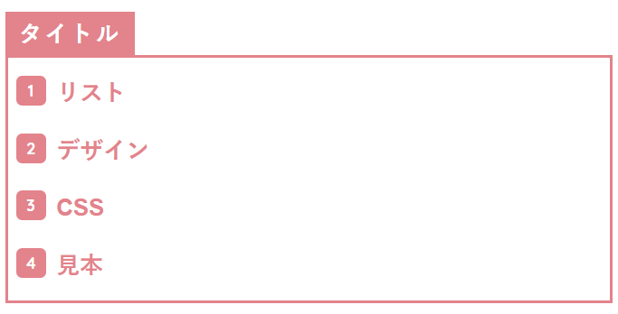
}22.区切り線ありのタイトル付きシンプルデザイン
箇条書き(ul)
番号付きの箇条書き(ol)
.list8 {
  margin: 3em 0 1em 0;
}
.list8-title {
  display: inline-block;
  padding: 1px 10px 0 10px;
  background: #ee8992;
  color: #fff;
  letter-spacing: 0.1em;
  font-weight: bold;
}
.list8 ul,.list8 ol {
  position: relative;
  border: solid 2px #ee8992;
  margin: 0;
  padding: 0;
}
.list8 ol {
  counter-reset: number;
}
.list8 ul li,.list8 ol li  {
  color: #ee8992;
  line-height: 1.5;
  padding: 0.5em 0.9em 0.5em 1.8em;
  border-bottom: dashed 1px #ee8992;
  list-style-type: none;
  font-weight: bold;
}
.list8 ul li:before {
  position: absolute;
  font-family: FontAwesome;
  content: "\f14a";
  left : 0.5em;
  color: #ee8992;
}
.list8 ol li:before {
  display: inline-block;
  position: absolute;
  font-family: "Quicksand", sans-serif;
  content: counter(number);
  counter-increment: number;
  left: 0.5em;
  width: 22px;
  height: 22px;
  border-radius: 20%;
  background: #ee8992;
  color: white;
  font-size: 12px;
  font-weight: bold;
  text-align: center;
  vertical-align: middle;
  line-height: 22px;
}
.list8 ul li:last-of-type,.list8 ol li:last-of-type{
  border-bottom: none;
}
23.背景に色を付けてより可愛く
箇条書き(ul)
番号付きの箇条書き(ol)
.list9 {
border: solid 2px #ee8992;
margin: 3em 0 1em 0;
border-radius: 6px;
background: #fff6e6;
}
.list9-title {
font-size: 1.15em;
background: #ee8992;
padding: 4px;
text-align: center;
color: #FFF;
font-weight: bold;
letter-spacing: 0.05em;
}
.list9 ul,.list9 ol {
position: relative;
margin: 0;
padding: 0 0.5em 0 0.5em;
color: #ee8992;
border: none;
list-style-type: none;
}
.list9 ol {
counter-reset: number;
}
.list9 ul li,.list9 ol li {
line-height: 1.5;
padding: 0.5em 0 0.5em 1.6em;
border-bottom: dashed 1px #ee8992;
}
.list9 ul li:before {
position: absolute;
font-family: FontAwesome;
content: "\f14a";
left : 0.7em;
color: #ee8992;
}
.list9 ol li:before {
display: inline-block;
position: absolute;
font-family: "Quicksand", sans-serif;
content: counter(number);
counter-increment: number;
left: 0.5em;
width: 22px;
height: 22px;
border-radius: 20%;
background: #ee8992;
color: white;
font-size: 12px;
font-weight: bold;
text-align: center;
vertical-align: middle;
line-height: 22px;
}
.list9 ol li:last-of-type,.list9 ul li:last-of-type{
border-bottom: none;
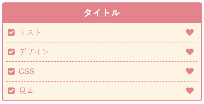
}24.ハートをつけてもっと可愛く
箇条書き(ul)
番号付きの箇条書き(ol)
.list10 {
border: solid 2px #ee8992;
margin: 3em 0 1em 0;
border-radius: 6px;
background: #fff6e6;
}
.list10-title {
font-size: 1.15em;
background: #ee8992;
padding: 4px;
text-align: center;
color: #FFF;
font-weight: bold;
letter-spacing: 0.05em;
}
.list10 ul,.list10 ol {
position: relative;
margin: 0;
padding: 0 0.5em 0 0.5em;
color: #ee8992;
border: none;
list-style-type: none;
}
.list10 ol {
counter-reset: number;
}
.list10 ul li,.list10 ol li {
line-height: 1.5;
padding: 0.5em 0 0.5em 1.6em;
border-bottom: dashed 1px #ee8992;
}
.list10 ul li:before {
position: absolute;
font-family: FontAwesome;
content: "\f14a";
left : 0.7em;
color: #ee8992;
}
.list10 ol li:before {
display: inline-block;
position: absolute;
font-family: "Quicksand", sans-serif;
content: counter(number);
counter-increment: number;
left: 0.5em;
width: 22px;
height: 22px;
border-radius: 20%;
background: #ee8992;
color: white;
font-size: 12px;
font-weight: bold;
text-align: center;
vertical-align: middle;
line-height: 22px;
}
.list10 ul:after,.list10 ol:after {
position: absolute;
font-family: FontAwesome;
content: "\f004";
right : 1em;
bottom : 0;
color: #ee8992;
font-size: 1.3em;
}
.list10 ul li:last-of-type,.list10 ol li:last-of-type{
border-bottom: none;
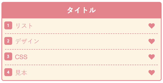
}25.全ての項目の後ろにハートを付けたデザイン
箇条書き(ul)
番号付きの箇条書き(ol)
.list11 {
  border: solid 2px #ee8992;
  margin: 3em 0 1em 0;
  border-radius: 6px;
  background: #fff6e6;
}
.list11-title {
  font-size: 1.15em;
  background: #ee8992;
  padding: 4px;
  text-align: center;
  color: #FFF;
  font-weight: bold;
  letter-spacing: 0.05em;
}
.list11 ul,.list11 ol {
  position: relative;
  margin: 0;
  padding: 0 0.5em 0 0.5em;
  color: #ee8992;
  border: none;
  list-style-type: none;
}
.list11 ol {
  counter-reset: number;
}
.list11 ul li,.list11 ol li {
  line-height: 1.5;
  padding: 0.5em 0 0.5em 1.6em;
  border-bottom: dashed 1px #ee8992;
}
.list11 ul li:before {
  position: absolute;
  font-family: FontAwesome;
  content: "\f14a";
  left : 0.7em;
  color: #ee8992;
}
.list11 ol li:before {
  display: inline-block;
  position: absolute;
  font-family: "Quicksand", sans-serif;
  content: counter(number);
  counter-increment: number;
  left: 0.5em;
  width: 22px;
  height: 22px;
  border-radius: 20%;
  background: #ee8992;
  color: white;
  font-size: 12px;
  font-weight: bold;
  text-align: center;
  vertical-align: middle;
  line-height: 22px;
}
.list11 li:after {
  position: absolute;
  font-family: FontAwesome;
  content: "\f004";
  right : 1em;
  color: #ee8992;
}
.list11 ul li:last-of-type,.list11 ol li:last-of-type{
  border-bottom: none;
}
26.水玉模様のノート
箇条書き(ul)
番号付きの箇条書き(ol)
.list31 {
  border: solid 2px #ffccd5;
  margin: 3em 0 1em 0;
  border-radius: 6px;
  background: #fff6e6;
  color: #ee8992;
  font-weight: bold;
}
.list31-title {
  border-bottom: solid 2px #ffccd5;
  font-size: 1.15em;
  border-radius: 6px 6px 0 0;
  background-color: #ffe6ea;
  background-image: radial-gradient(#fff4f9 24%, transparent 0), radial-gradient(#fff4f9 24%, transparent 0);
  background-position: 0 0, 10px 10px;
  background-size: 20px 20px;
  padding: 4px;
  text-align: center;
  color: #ee8992;
  font-weight: bold;
  letter-spacing: 0.05em;
}
.list31 ul,.list31 ol {
  position: relative;
 margin: 0;
  padding: 0 0.5em 0 0.5em;
  color: #ee8992;
  border: none;
  list-style-type: none;
}
.list31 ol {
  counter-reset: number;
}
.list31 ul li,.list31 ol li {
  line-height: 1.5;
  padding: 0.5em 0 0.5em 1.6em;
  border-bottom: dashed 1px #ee8992;
}
.list31 ul li:before {
  position: absolute;
  font-family: FontAwesome;
  content: "\f14a";
  left : 0.7em;
  color: #ee8992;
}
.list31 ol li:before {
  display: inline-block;
  position: absolute;
  font-family: "Quicksand", sans-serif;
  content: counter(number);
  counter-increment: number;
  left: 0.5em;
  width: 22px;
  height: 22px;
  border-radius: 20%;
  background: #ee8992;
  color: white;
  font-size: 12px;
  font-weight: bold;
  text-align: center;
  vertical-align: middle;
  line-height: 22px;
}
.list31 ol li:last-of-type,.list31 ul li:last-of-type{
  border-bottom: none;
}
27.ストライプのノート
箇条書き(ul)
番号付きの箇条書き(ol)
.list32 {
border: solid 2px #ffccd5;
margin: 3em 0 1em 0;
border-radius: 6px;
background: #fff6e6;
color: #ee8992;
font-weight: bold;
}
.list32-title {
border-bottom: solid 2px #ffccd5;
font-size: 1.15em;
border-radius: 6px 6px 0 0;
background: repeating-linear-gradient(-45deg, #fef4f4, #fef4f4 3px,#ffe5e5 3px, #ffe5e5 7px);
padding: 4px;
text-align: center;
color: #ee8992;
font-weight: bold;
letter-spacing: 0.05em;
}
.list32 ul,.list32 ol {
position: relative;
margin: 0;
padding: 0 0.5em 0 0.5em;
color: #ee8992;
border: none;
list-style-type: none;
}
.list32 ol {
counter-reset: number;
}
.list32 ul li,.list32 ol li {
line-height: 1.5;
padding: 0.5em 0 0.5em 1.6em;
border-bottom: dashed 1px #ee8992;
}
.list32 ul li:before {
position: absolute;
font-family: FontAwesome;
content: "\f14a";
left : 0.7em;
color: #ee8992;
}
.list32 ol li:before {
display: inline-block;
position: absolute;
font-family: "Quicksand", sans-serif;
content: counter(number);
counter-increment: number;
left: 0.5em;
width: 22px;
height: 22px;
border-radius: 20%;
background: #ee8992;
color: white;
font-size: 12px;
font-weight: bold;
text-align: center;
vertical-align: middle;
line-height: 22px;
}
.list32 ol li:last-of-type,.list32 ul li:last-of-type{
border-bottom: none;
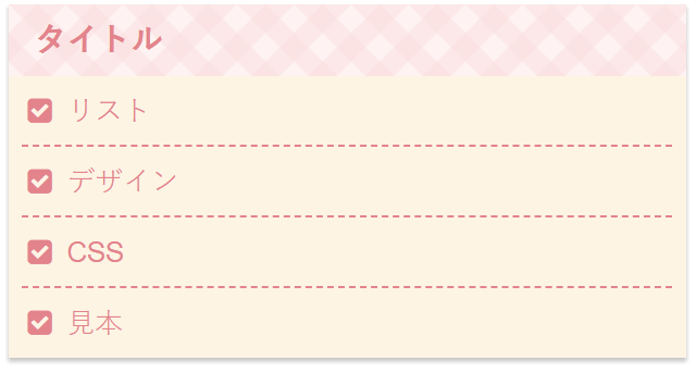
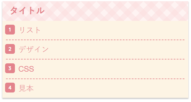
}28.チェック柄のノート
箇条書き(ul)
番号付きの箇条書き(ol)
.list33 {
  border: solid 2px #ffccd5;
  margin: 3em 0 1em 0;
  border-radius: 6px;
  background: #fff6e6;
  color: #ee8992;
  font-weight: bold;
}
.list33-title {
  border-bottom: solid 2px #ffccd5;
  font-size: 1.15em;
  border-radius: 6px 6px 0 0;
  background-color: #fff4f4;
  background-image:
  linear-gradient(-45deg, rgba(255,224,224,.5) 25%, transparent 25%, transparent 50%, rgba(255,224,224,.5) 50%, rgba(255,224,224,.5) 75%, transparent 75%, transparent 100%),
  linear-gradient(45deg, rgba(255,224,224,.5) 25%, transparent 25%, transparent 50%, rgba(255,224,224,.5) 50%, rgba(255,224,224,.5) 75%, transparent 75%, transparent 100%);
  background-size: 35px 35px;
  color: #ee8992;
  padding: 4px;
  text-align: center;
  font-weight: bold;
  letter-spacing: 0.05em;
}
.list33 ul,.list33 ol {
  position: relative;
 margin: 0;
  padding: 0 0.5em 0 0.5em;
  color: #ee8992;
  border: none;
  list-style-type: none;
}
.list33 ol {
  counter-reset: number;
}
.list33 ul li,.list33 ol li {
  line-height: 1.5;
  padding: 0.5em 0 0.5em 1.6em;
  border-bottom: dashed 1px #ee8992;
}
.list33 ul li:before {
  position: absolute;
  font-family: FontAwesome;
  content: "\f14a";
  left : 0.7em;
  color: #ee8992;
}
.list33 ol li:before {
  display: inline-block;
  position: absolute;
  font-family: "Quicksand", sans-serif;
  content: counter(number);
  counter-increment: number;
  left: 0.5em;
  width: 22px;
  height: 22px;
  border-radius: 20%;
  background: #ee8992;
  color: white;
  font-size: 12px;
  font-weight: bold;
  text-align: center;
  vertical-align: middle;
  line-height: 22px;
}
.list33 ol li:last-of-type,.list33 ul li:last-of-type{
  border-bottom: none;
}
29.影付きのメモ帳のようなデザイン
箇条書き(ul)
番号付きの箇条書き(ol)
.list12 {
  margin: 3em 0 1em 0;
  background: #fff6e6;
  box-shadow: 0 2px 3px rgba(0,0,0,.22);
}
.list12-title {
  font-size: 1.15em;
  padding: 4px 0 4px 16px;
  background: #ee8992;
  color: #fff6e6;
  font-weight:bold;
}
.list12 ul,.list12 ol {
  position: relative;
  margin: 0;
  padding: 0 0.5em 0 0.5em;
  color: #ee8992;
  border: none;
  list-style-type: none;
}
.list12 ol {
  counter-reset: number;
}
.list12 ul li,.list12 ol li {
  line-height: 1.5;
  padding: 0.5em 0 0.5em 1.6em;
  border-bottom: dashed 1px #ee8992;
}
.list12 ul li:before {
  position: absolute;
  font-family: FontAwesome;
  content: "\f14a";
  left : 0.7em;
  color: #ee8992;
}
.list12 ol li:before {
  display: inline-block;
  position: absolute;
  font-family: "Quicksand", sans-serif;
  content: counter(number);
  counter-increment: number;
  left: 0.5em;
  width: 22px;
  height: 22px;
  border-radius: 20%;
  background: #ee8992;
  color: white;
  font-size: 12px;
  font-weight: bold;
  text-align: center;
  vertical-align: middle;
  line-height: 22px;
}
.list12 ul li:last-of-type,.list12 ol li:last-of-type{
  border-bottom: none;
}
30.水玉模様のメモ帳
箇条書き(ul)
番号付きの箇条書き(ol)
.list34 {
  margin: 3em 0 1em 0;
  background: #fff6e6;
  box-shadow: 0 2px 3px rgba(0,0,0,.22);
}
.list34-title {
  font-size: 1.15em;
  padding: 4px 0 4px 16px;
  background-color: #ffe6ea;
  background-image: radial-gradient(#fff4f9 24%, transparent 0), radial-gradient(#fff4f9 24%, transparent 0);
  background-position: 0 0, 10px 10px;
  background-size: 20px 20px;
  color: #ee8992;
  font-weight:bold;
}
.list34 ul,.list34 ol {
  position: relative;
  margin: 0;
  padding: 0 0.5em 0 0.5em;
  color: #ee8992;
  border: none;
  list-style-type: none;
}
.list34 ol {
  counter-reset: number;
}
.list34 ul li,.list34 ol li {
  line-height: 1.5;
  padding: 0.5em 0 0.5em 1.6em;
  border-bottom: dashed 1px #ee8992;
}
.list34 ul li:before {
  position: absolute;
  font-family: FontAwesome;
  content: "\f14a";
  left : 0.7em;
  color: #ee8992;
}
.list34 ol li:before {
  display: inline-block;
  position: absolute;
  font-family: "Quicksand", sans-serif;
  content: counter(number);
  counter-increment: number;
  left: 0.5em;
  width: 22px;
  height: 22px;
  border-radius: 20%;
  background: #ee8992;
  color: white;
  font-size: 12px;
  font-weight: bold;
  text-align: center;
  vertical-align: middle;
  line-height: 22px;
}
.list34 ul li:last-of-type,.list34 ol li:last-of-type{
  border-bottom: none;
}
31.ストライプのメモ帳
箇条書き(ul)

番号付きの箇条書き(ol)

.list35 {
margin: 3em 0 1em 0;
background: #fff6e6;
box-shadow: 0 2px 3px rgba(0,0,0,.22);
}
.list35-title {
font-size: 1.15em;
padding: 4px 0 4px 16px;
background: repeating-linear-gradient(-45deg, #fef4f4, #fef4f4 3px,#ffe5e5 3px, #ffe5e5 7px);
color: #ee8992;
color: #ee8992;
font-weight:bold;
}
.list35 ul,.list35 ol {
position: relative;
margin: 0;
padding: 0 0.5em 0 0.5em;
color: #ee8992;
border: none;
list-style-type: none;
}
.list35 ol {
counter-reset: number;
}
.list35 ul li,.list35 ol li {
line-height: 1.5;
padding: 0.5em 0 0.5em 1.6em;
border-bottom: dashed 1px #ee8992;
}
.list35 ul li:before {
position: absolute;
font-family: FontAwesome;
content: "\f14a";
left : 0.7em;
color: #ee8992;
}
.list35 ol li:before {
display: inline-block;
position: absolute;
font-family: "Quicksand", sans-serif;
content: counter(number);
counter-increment: number;
left: 0.5em;
width: 22px;
height: 22px;
border-radius: 20%;
background: #ee8992;
color: white;
font-size: 12px;
font-weight: bold;
text-align: center;
vertical-align: middle;
line-height: 22px;
}
.list35 ul li:last-of-type,.list35 ol li:last-of-type{
border-bottom: none;
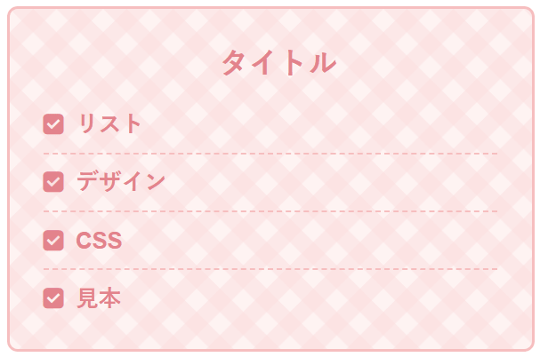
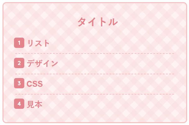
}32.チェック柄のメモ帳
箇条書き(ul)
番号付きの箇条書き(ol)
.list36 {
  margin: 3em 0 1em 0;
  background: #fff6e6;
  box-shadow: 0 2px 3px rgba(0,0,0,.22);
}
.list36-title {
  font-size: 1.15em;
  padding: 4px 0 4px 16px;
  background-color: #fff4f4;
  background-image:
  linear-gradient(-45deg, rgba(255,224,224,.5) 25%, transparent 25%, transparent 50%, rgba(255,224,224,.5) 50%, rgba(255,224,224,.5) 75%, transparent 75%, transparent 100%),
  linear-gradient(45deg, rgba(255,224,224,.5) 25%, transparent 25%, transparent 50%, rgba(255,224,224,.5) 50%, rgba(255,224,224,.5) 75%, transparent 75%, transparent 100%);
  background-size: 35px 35px;
  color: #ee8992;
  font-weight:bold;
}
.list36 ul,.list36 ol {
  position: relative;
  margin: 0;
  padding: 0 0.5em 0 0.5em;
  color: #ee8992;
  border: none;
  list-style-type: none;
}
.list36 ol {
  counter-reset: number;
}
.list36 ul li,.list36 ol li {
  line-height: 1.5;
  padding: 0.5em 0 0.5em 1.6em;
  border-bottom: dashed 1px #ee8992;
}
.list36 ul li:before {
  position: absolute;
  font-family: FontAwesome;
  content: "\f14a";
  left : 0.7em;
  color: #ee8992;
}
.list36 ol li:before {
  display: inline-block;
  position: absolute;
  font-family: "Quicksand", sans-serif;
  content: counter(number);
  counter-increment: number;
  left: 0.5em;
  width: 22px;
  height: 22px;
  border-radius: 20%;
  background: #ee8992;
  color: white;
  font-size: 12px;
  font-weight: bold;
  text-align: center;
  vertical-align: middle;
  line-height: 22px;
}
.list36 ul li:last-of-type,.list36 ol li:last-of-type{
  border-bottom: none;
}
33.テープでメモ帳を張り付けたようなデザイン
箇条書き(ul)
番号付きの箇条書き(ol)
.list13 {
position: relative;
margin: 3em 0 1em 0;
background: #fff6e6;
box-shadow: 0 2px 3px rgba(0,0,0,.22);
}
.list13-title {
font-size: 1.15em;
padding: 4px 0 4px 16px;
color: #ee8992;
font-weight:bold;
}
.list13:after {
position: absolute;
content: "";
top: 25px;
width: 30%;
height: 35px;
opacity: 0.3;
margin: -35px auto 10px 35%;
background: #db7093;
transform: rotate(-2deg);
left: 10px;
right: 10px;
}
.list13 ul,.list13 ol {
position: relative;
margin: 0;
padding: 0 0.5em 0 0.5em;
color: #ee8992;
border: none;
list-style-type: none;
}
.list13 ol {
counter-reset: number;
}
.list13 ul li,.list13 ol li {
line-height: 1.5;
padding: 0.5em 0 0.5em 1.6em;
border-bottom: dashed 1px #ee8992;
}
.list13 ul li:before {
position: absolute;
font-family: FontAwesome;
content: "\f14a";
left : 0.7em;
color: #ee8992;
}
.list13 ol li:before {
display: inline-block;
position: absolute;
font-family: "Quicksand", sans-serif;
content: counter(number);
counter-increment: number;
left: 0.5em;
width: 22px;
height: 22px;
border-radius: 20%;
background: #ee8992;
color: white;
font-size: 12px;
font-weight: bold;
text-align: center;
vertical-align: middle;
line-height: 22px;
}
.list13 ul li:last-of-type,.list13 ol li:last-of-type{
border-bottom: none;
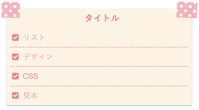
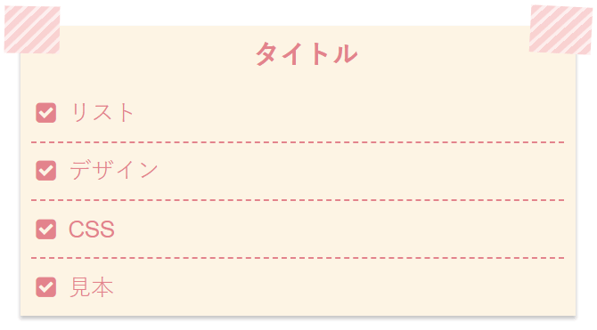
}34.水玉のテープでメモ帳を張り付けたようなリストデザイン
箇条書き(ul)
番号付きの箇条書き(ol)
.list37 {
  position: relative;
  margin: 3em 0 1em 0;
  background: #fff6e6;
  box-shadow: 0 2px 3px rgba(0,0,0,.22);
}
.list37-title {
  font-size: 1.15em;
  padding: 4px 0 4px 16px;
  color: #ee8992;
  font-weight:bold;
}
.list37:after {
  position: absolute;
  content: "";
  top: 25px;
  width: 30%;
  height: 35px;
  opacity: 0.7;
  margin: -35px auto 10px 35%;
  background-color: #ff99ac;
  background-image: radial-gradient(#fff 24%, transparent 0), radial-gradient(#fff 24%, transparent 0);
  background-position: 0 0, 10px 10px;
  background-size: 20px 20px;
  transform: rotate(-2deg);
  left: 10px;
  right: 10px;
}
.list37 ul,.list37 ol  {
  position: relative;
  margin: 0;
  padding: 0 0.5em 0 0.5em;
  color: #ee8992;
  border: none;
  list-style-type: none;
}
.list37 ol {
  counter-reset: number;
}
.list37 ul li,.list37 ol li {
  line-height: 1.5;
  padding: 0.5em 0 0.5em 1.6em;
  border-bottom: dashed 1px #ee8992;
}
.list37 ul li:before {
  position: absolute;
 font-family: FontAwesome;
  content: "\f14a";
  left : 0.7em;
  color: #ee8992;
}
.list37 ol li:before {
  display: inline-block;
  position: absolute;
  font-family: "Quicksand", sans-serif;
  content: counter(number);
  counter-increment: number;
  left: 0.5em;
  width: 22px;
  height: 22px;
  border-radius: 20%;
  background: #ee8992;
  color: white;
  font-size: 12px;
  font-weight: bold;
  text-align: center;
  vertical-align: middle;
  line-height: 22px;
}
.list37 ul li:last-of-type,.list37 ol li:last-of-type{
  border-bottom: none;
}
35.ストライプのテープ
箇条書き(ul)
番号付きの箇条書き(ol)
.list38 {
  position: relative;
  margin: 3em 0 1em 0;
  background: #fff6e6;
  box-shadow: 0 2px 3px rgba(0,0,0,.22);
}
.list38-title {
  font-size: 1.15em;
  padding: 4px 0 4px 16px;
  color: #ee8992;
  font-weight:bold;
}
.list38:after {
  position: absolute;
  content: "";
  top: 25px;
  width: 30%;
  height: 35px;
  opacity: 0.9;
  margin: -35px auto 10px 35%;
  background: repeating-linear-gradient(-45deg, #ffefef, #ffefef 2px,#ffd1d1 3px, #ffd1d1 7px);
  transform: rotate(-2deg);
  left: 10px;
  right: 10px;
}
.list38 ul,.list38 ol  {
  position: relative;
  margin: 0;
  padding: 0 0.5em 0 0.5em;
  color: #ee8992;
  border: none;
  list-style-type: none;
}
.list38 ol {
  counter-reset: number;
}
.list38 ul li,.list38 ol li {
  line-height: 1.5;
  padding: 0.5em 0 0.5em 1.6em;
  border-bottom: dashed 1px #ee8992;
}
.list38 ul li:before {
  position: absolute;
 font-family: FontAwesome;
  content: "\f14a";
  left : 0.7em;
  color: #ee8992;
}
.list38 ol li:before {
  display: inline-block;
  position: absolute;
  font-family: "Quicksand", sans-serif;
  content: counter(number);
  counter-increment: number;
  left: 0.5em;
  width: 22px;
  height: 22px;
  border-radius: 20%;
  background: #ee8992;
  color: white;
  font-size: 12px;
  font-weight: bold;
  text-align: center;
  vertical-align: middle;
  line-height: 22px;
}
.list38 ul li:last-of-type,.list38 ol li:last-of-type{
  border-bottom: none;
}
36.チェック柄ののテープ
箇条書き(ul)
番号付きの箇条書き(ol)
.list39 {
  position: relative;
  margin: 3em 0 1em 0;
  background: #fff6e6;
  box-shadow: 0 2px 3px rgba(0,0,0,.22);
}
.list39-title {
  font-size: 1.15em;
  padding: 4px 0 4px 16px;
  color: #ee8992;
  font-weight:bold;
}
.list39:after {
  position: absolute;
  content: "";
  top: 25px;
  width: 30%;
  height: 35px;
  opacity: 0.8;
  margin: -35px auto 10px 35%;
  background-color: #ffeaea;
  background-image:
  linear-gradient(-45deg, rgba(255,188,188,.5) 25%, transparent 25%, transparent 50%, rgba(255,188,188,.5) 50%, rgba(255,188,188,.5) 75%, transparent 75%, transparent 100%),
  linear-gradient(45deg, rgba(255,188,188,.5) 25%, transparent 25%, transparent 50%, rgba(255,188,188,.5) 50%, rgba(255,188,188,.5) 75%, transparent 75%, transparent 100%);
  background-size: 35px 35px;
  transform: rotate(-2deg);
  left: 10px;
  right: 10px;
}
.list39 ul,.list39 ol  {
  position: relative;
  margin: 0;
  padding: 0 0.5em 0 0.5em;
  color: #ee8992;
  border: none;
  list-style-type: none;
}
.list39 ol {
  counter-reset: number;
}
.list39 ul li,.list39 ol li {
  line-height: 1.5;
  padding: 0.5em 0 0.5em 1.6em;
  border-bottom: dashed 1px #ee8992;
}
.list39 ul li:before {
  position: absolute;
 font-family: FontAwesome;
  content: "\f14a";
  left : 0.7em;
  color: #ee8992;
}
.list39 ol li:before {
  display: inline-block;
  position: absolute;
  font-family: "Quicksand", sans-serif;
  content: counter(number);
  counter-increment: number;
  left: 0.5em;
  width: 22px;
  height: 22px;
  border-radius: 20%;
  background: #ee8992;
  color: white;
  font-size: 12px;
  font-weight: bold;
  text-align: center;
  vertical-align: middle;
  line-height: 22px;
}
.list39 ul li:last-of-type,.list39 ol li:last-of-type{
  border-bottom: none;
}
37.両側をテープで張り付けたようなデザイン
箇条書き(ul)
番号付きの箇条書き(ol)
.list14 {
  margin: 3em 0 1em 0;
  background: #fff6e6;
  box-shadow: 0 2px 3px rgba(0,0,0,.22);
}
.list14-title {
  position: relative;
  font-size: 1.15em;
  padding: 4px 0 4px 12px;
  color: #ee8992;
  font-weight:bold;
  text-align: center;
}
.list14-title:before {
  position: absolute;
  content: "";
  top: 25px;
  width: 10%;
  height: 35px;
  opacity: 0.3;
  margin: -40px auto 10px -22px;
  background: #db7093;
  transform: rotate(1deg);
  left: 10px;
  right: 10px;
}
.list14-title:after {
  position: absolute;
  content: "";
  top: 25px;
  width: 11%;
  height: 35px;
  opacity: 0.3;
  margin: -40px -22px 10px auto;
  background: #db7093;
  transform: rotate(3deg);
  left: 10px;
  right: 10px;
}
.list14 ul,.list14 ol {
  margin: 0;
  padding: 0 0.5em 0 0.5em;
  position: relative;
  color: #ee8992;
  border: none;
  list-style-type: none;
}
.list14 ol {
  counter-reset: number;
}
.list14 ul li,.list14 ol li {
  line-height: 1.5;
  padding: 0.5em 0 0.5em 1.6em;
  border-bottom: dashed 1px #ee8992;
}
.list14 ul li:before {
  font-family: FontAwesome;
  content: "\f14a";
  position: absolute;
  left : 0.7em;
  color: #ee8992;
}
.list14 ol li:before {
  display: inline-block;
  position: absolute;
  font-family: "Quicksand", sans-serif;
  content: counter(number);
  counter-increment: number;
  left: 0.5em;
  width: 22px;
  height: 22px;
  border-radius: 20%;
  background: #ee8992;
  color: white;
  font-size: 12px;
  font-weight: bold;
  text-align: center;
  vertical-align: middle;
  line-height: 22px;
}
.list14 ul li:last-of-type,.list14 ol li:last-of-type{
  border-bottom: none;
}
38.両側に水玉模様のテープ
箇条書き(ul)
番号付きの箇条書き(ol)
.list40 {
  margin: 3em 0 1em 0;
  background: #fff6e6;
  box-shadow: 0 2px 3px rgba(0,0,0,.22);
}
.list40-title {
  position: relative;
  font-size: 1.15em;
  padding: 4px 0 4px 12px;
  color: #ee8992;
  font-weight:bold;
  text-align: center;
}
.list40-title:before {
  position: absolute;
  content: "";
  top: 25px;
  width: 10%;
  height: 35px;
  opacity: 0.7;
  margin: -40px auto 10px -22px;
  background-color: #ff99ac;
  background-image: radial-gradient(#fff 24%, transparent 0), radial-gradient(#fff 24%, transparent 0);
  background-position: 0 0, 10px 10px;
  background-size: 20px 20px;
  transform: rotate(1deg);
  left: 10px;
  right: 10px;
}
.list40-title:after {
  position: absolute;
  content: "";
  top: 25px;
  width: 11%;
  height: 35px;
  opacity: 0.7;
  margin: -40px -22px 10px auto;
  background-color: #ff99ac;
  background-image: radial-gradient(#fff 24%, transparent 0), radial-gradient(#fff 24%, transparent 0);
  background-position: 0 0, 10px 10px;
  background-size: 20px 20px;
  transform: rotate(3deg);
  left: 10px;
  right: 10px;
}
.list40 ul,.list40 ol {
  margin: 0;
  padding: 0 0.5em 0 0.5em;
  position: relative;
  color: #ee8992;
  border: none;
  list-style-type: none;
}
.list40 ol {
  counter-reset: number;
}
.list40 ul li,.list40 ol li {
  line-height: 1.5;
  padding: 0.5em 0 0.5em 1.6em;
  border-bottom: dashed 1px #ee8992;
}
.list40 ul li:before {
  font-family: FontAwesome;
  content: "\f14a";
  position: absolute;
  left : 0.7em;
  color: #ee8992;
}
.list40 ol li:before {
  display: inline-block;
  position: absolute;
  font-family: "Quicksand", sans-serif;
  content: counter(number);
  counter-increment: number;
  left: 0.5em;
  width: 22px;
  height: 22px;
  border-radius: 20%;
  background: #ee8992;
  color: white;
  font-size: 12px;
  font-weight: bold;
  text-align: center;
  vertical-align: middle;
  line-height: 22px;
}
.list40 ul li:last-of-type,.list40 ol li:last-of-type{
  border-bottom: none;
}
39.両側にストライプのテープ
箇条書き(ul)
番号付きの箇条書き(ol)
.list41 {
  margin: 3em 0 1em 0;
  background: #fff6e6;
  box-shadow: 0 2px 3px rgba(0,0,0,.22);
}
.list41-title {
  position: relative;
  font-size: 1.15em;
  padding: 4px 0 4px 12px;
  color: #ee8992;
  font-weight:bold;
  text-align: center;
}
.list41-title:before {
  position: absolute;
  content: "";
  top: 25px;
  width: 10%;
  height: 35px;
  opacity: 0.9;
  margin: -40px auto 10px -22px;
  background: repeating-linear-gradient(-45deg, #ffefef, #ffefef 2px,#ffd1d1 3px, #ffd1d1 7px);
  transform: rotate(1deg);
  left: 10px;
  right: 10px;
}
.list41-title:after {
  position: absolute;
  content: "";
  top: 25px;
  width: 11%;
  height: 35px;
  opacity: 0.9;
  margin: -40px -22px 10px auto;
  background: repeating-linear-gradient(-45deg, #ffefef, #ffefef 2px,#ffd1d1 3px, #ffd1d1 7px);
  transform: rotate(3deg);
  left: 10px;
  right: 10px;
}
.list41 ul,.list41 ol {
  margin: 0;
  padding: 0 0.5em 0 0.5em;
  position: relative;
  color: #ee8992;
  border: none;
  list-style-type: none;
}
.list41 ol {
  counter-reset: number;
}
.list41 ul li,.list41 ol li {
  line-height: 1.5;
  padding: 0.5em 0 0.5em 1.6em;
  border-bottom: dashed 1px #ee8992;
}
.list41 ul li:before {
  font-family: FontAwesome;
  content: "\f14a";
  position: absolute;
  left : 0.7em;
  color: #ee8992;
}
.list41 ol li:before {
  display: inline-block;
  position: absolute;
  font-family: "Quicksand", sans-serif;
  content: counter(number);
  counter-increment: number;
  left: 0.5em;
  width: 22px;
  height: 22px;
  border-radius: 20%;
  background: #ee8992;
  color: white;
  font-size: 12px;
  font-weight: bold;
  text-align: center;
  vertical-align: middle;
  line-height: 22px;
}
.list41 ul li:last-of-type,.list41 ol li:last-of-type{
  border-bottom: none;
}
40.両側にチェック柄のテープ
箇条書き(ul)
番号付きの箇条書き(ol)
.list42 {
  margin: 3em 0 1em 0;
  background: #fff6e6;
  box-shadow: 0 2px 3px rgba(0,0,0,.22);
}
.list42-title {
  position: relative;
  font-size: 1.15em;
  padding: 4px 0 4px 12px;
  color: #ee8992;
  font-weight:bold;
  text-align: center;
}
.list42-title:before {
  position: absolute;
  content: "";
  top: 25px;
  width: 10%;
  height: 35px;
  opacity: 0.8;
  margin: -40px auto 10px -22px;
  background-color: #ffeaea;
  background-image:
  linear-gradient(-45deg, rgba(255,188,188,.5) 25%, transparent 25%, transparent 50%, rgba(255,188,188,.5) 50%, rgba(255,188,188,.5) 75%, transparent 75%, transparent 100%),
  linear-gradient(45deg, rgba(255,188,188,.5) 25%, transparent 25%, transparent 50%, rgba(255,188,188,.5) 50%, rgba(255,188,188,.5) 75%, transparent 75%, transparent 100%);
  background-size: 35px 35px;
  transform: rotate(1deg);
  left: 10px;
  right: 10px;
}
.list42-title:after {
  position: absolute;
  content: "";
  top: 25px;
  width: 11%;
  height: 35px;
  opacity: 0.8;
  margin: -40px -22px 10px auto;
  background-color: #ffeaea;
  background-image:
  linear-gradient(-45deg, rgba(255,188,188,.5) 25%, transparent 25%, transparent 50%, rgba(255,188,188,.5) 50%, rgba(255,188,188,.5) 75%, transparent 75%, transparent 100%),
  linear-gradient(45deg, rgba(255,188,188,.5) 25%, transparent 25%, transparent 50%, rgba(255,188,188,.5) 50%, rgba(255,188,188,.5) 75%, transparent 75%, transparent 100%);
  background-size: 35px 35px;
  transform: rotate(3deg);
  left: 10px;
  right: 10px;
}
.list42 ul,.list42 ol {
  margin: 0;
  padding: 0 0.5em 0 0.5em;
  position: relative;
  color: #ee8992;
  border: none;
  list-style-type: none;
}
.list42 ol {
  counter-reset: number;
}
.list42 ul li,.list42 ol li {
  line-height: 1.5;
  padding: 0.5em 0 0.5em 1.6em;
  border-bottom: dashed 1px #ee8992;
}
.list42 ul li:before {
  font-family: FontAwesome;
  content: "\f14a";
  position: absolute;
  left : 0.7em;
  color: #ee8992;
}
.list42 ol li:before {
  display: inline-block;
  position: absolute;
  font-family: "Quicksand", sans-serif;
  content: counter(number);
  counter-increment: number;
  left: 0.5em;
  width: 22px;
  height: 22px;
  border-radius: 20%;
  background: #ee8992;
  color: white;
  font-size: 12px;
  font-weight: bold;
  text-align: center;
  vertical-align: middle;
  line-height: 22px;
}
.list42 ul li:last-of-type,.list42 ol li:last-of-type{
  border-bottom: none;
}
41.手紙風なデザイン
箇条書き(ul)
番号付きの箇条書き(ol)
.list15 {
  margin: 2em 10px;
  padding: 1em;
  border: dashed 2px #ffc3c3;
  border-radius: 8px;
  background: #fff6e6;
  box-shadow: 0 0 0 10px #fff6e6;
}
.list15-title {
  position: relative;
  font-size: 1.3em;
  padding: 4px 0 4px 12px;
  color: #ee8992;
  font-weight:bold;
  text-align: center;
}
.list15 ul,.list15 ol {
  position: relative;
  margin: 0;
  padding: 0 0.5em 0 0.5em;
  color: #ee8992;
  border: none;
  list-style-type: none;
}
.list15 ol {
  counter-reset: number;
}
.list15 ul li,.list15 ol li {
  line-height: 1.5;
  padding: 0.5em 0 0.5em 1.4em;
  border-bottom: dashed 1px #ffc3c3;
}
.list15 ul li:before {
  position: absolute;
  font-family: FontAwesome;
  content: "\f14a";
  left : 0.5em;
  color: #ee8992;
}
.list15 ol li:before {
  display: inline-block;
  position: absolute;
  font-family: "Quicksand", sans-serif;
  content: counter(number);
  counter-increment: number;
  left: 0.5em;
  width: 22px;
  height: 22px;
  border-radius: 20%;
  background: #ee8992;
  color: white;
  font-size: 12px;
  font-weight: bold;
  text-align: center;
  vertical-align: middle;
  line-height: 22px;
}
.list15 ul li:last-of-type,.list15 ol li:last-of-type{
  border-bottom: none;
}
42.水玉模様の手紙風
箇条書き(ul)
番号付きの箇条書き(ol)
.list43 {
  margin: 2em 10px;
  padding: 1em;
  border: solid 2px #ffc3c3;
  border-radius: 8px;
  font-weight: bold;
  color: #ee8992;
  background-color: #fff9fc;
  background-image: radial-gradient(#fff4f9 35%, transparent 0), radial-gradient(#fff4f9 35%, transparent 0);
  background-position: 0 0, 40px 40px;
  background-size: 80px 80px;
}
.list43-title {
  position: relative;
  font-size: 1.3em;
  padding: 4px 0 4px 12px;
  color: #ee8992;
  font-weight:bold;
  text-align: center;
}
.list43 ul,.list43 ol {
  position: relative;
  margin: 0;
  padding: 0 0.5em 0 0.5em;
  color: #ee8992;
  border: none;
  list-style-type: none;
}
.list43 ol {
  counter-reset: number;
}
.list43 ul li,.list43 ol li {
  line-height: 1.5;
  padding: 0.5em 0 0.5em 1.4em;
  border-bottom: dashed 1px #ffc3c3;
}
.list43 ul li:before {
  position: absolute;
  font-family: FontAwesome;
  content: "\f14a";
  left : 0.5em;
  color: #ee8992;
}
.list43 ol li:before {
  display: inline-block;
  position: absolute;
  font-family: "Quicksand", sans-serif;
  content: counter(number);
  counter-increment: number;
  left: 0.5em;
  width: 22px;
  height: 22px;
  border-radius: 20%;
  background: #ee8992;
  color: white;
  font-size: 12px;
  font-weight: bold;
  text-align: center;
  vertical-align: middle;
  line-height: 22px;
}
.list43 ul li:last-of-type,.list43 ol li:last-of-type{
  border-bottom: none;
}
43.水玉模様の手紙風
箇条書き(ul)
番号付きの箇条書き(ol)

.list44 {
  margin: 2em 10px;
  padding: 1em;
  border: solid 2px #ffc3c3;
  border-radius: 8px;
  font-weight: bold;
  color: #ee8992;
  background-color: #fff;
  background-image: radial-gradient(#fff4f9 50%, transparent 0), radial-gradient(#fff4f9 50%, transparent 0);
  background-position: 0 0, 20px 20px;
  background-size: 40px 40px;
}
.list44-title {
  position: relative;
  font-size: 1.3em;
  padding: 4px 0 4px 12px;
  color: #ee8992;
  font-weight:bold;
  text-align: center;
}
.list44 ul,.list44 ol {
  position: relative;
  margin: 0;
  padding: 0 0.5em 0 0.5em;
  color: #ee8992;
  border: none;
  list-style-type: none;
}
.list44 ol {
  counter-reset: number;
}
.list44 ul li,.list44 ol li {
  line-height: 1.5;
  padding: 0.5em 0 0.5em 1.4em;
  border-bottom: dashed 1px #ffc3c3;
}
.list44 ul li:before {
  position: absolute;
  font-family: FontAwesome;
  content: "\f14a";
  left : 0.5em;
  color: #ee8992;
}
.list44 ol li:before {
  display: inline-block;
  position: absolute;
  font-family: "Quicksand", sans-serif;
  content: counter(number);
  counter-increment: number;
  left: 0.5em;
  width: 22px;
  height: 22px;
  border-radius: 20%;
  background: #ee8992;
  color: white;
  font-size: 12px;
  font-weight: bold;
  text-align: center;
  vertical-align: middle;
  line-height: 22px;
}
.list44 ul li:last-of-type,.list44 ol li:last-of-type{
  border-bottom: none;
}
44.ストライプの手紙風
箇条書き(ul)
番号付きの箇条書き(ol)
.list45 {
  margin: 2em 10px;
  padding: 1em;
  border: solid 2px #ffc3c3;
  border-radius: 8px;
  font-weight: bold;
  color: #ee8992;
  background: repeating-linear-gradient(-45deg, #fef4f4, #fef4f4 3px,#ffefef 3px, #ffefef 7px);
}
.list45-title {
  position: relative;
  font-size: 1.3em;
  padding: 4px 0 4px 12px;
  color: #ee8992;
  font-weight:bold;
  text-align: center;
}
.list45 ul,.list45 ol {
  position: relative;
  margin: 0;
  padding: 0 0.5em 0 0.5em;
  color: #ee8992;
  border: none;
  list-style-type: none;
}
.list45 ol {
  counter-reset: number;
}
.list45 ul li,.list45 ol li {
  line-height: 1.5;
  padding: 0.5em 0 0.5em 1.4em;
  border-bottom: dashed 1px #ffc3c3;
}
.list45 ul li:before {
  position: absolute;
  font-family: FontAwesome;
  content: "\f14a";
  left : 0.5em;
  color: #ee8992;
}
.list45 ol li:before {
  display: inline-block;
  position: absolute;
  font-family: "Quicksand", sans-serif;
  content: counter(number);
  counter-increment: number;
  left: 0.5em;
  width: 22px;
  height: 22px;
  border-radius: 20%;
  background: #ee8992;
  color: white;
  font-size: 12px;
  font-weight: bold;
  text-align: center;
  vertical-align: middle;
  line-height: 22px;
}
.list45 ul li:last-of-type,.list45 ol li:last-of-type{
  border-bottom: none;
}
45.チェック柄の手紙風
箇条書き(ul)
番号付きの箇条書き(ol)
.list46 {
  margin: 2em 10px;
  padding: 1em;
  border: solid 2px #ffc3c3;
  border-radius: 8px;
  font-weight: bold;
  color: #ee8992;
  background-color: #fff4f4;
  background-image:
  linear-gradient(-45deg, rgba(255,224,224,.5) 25%, transparent 25%, transparent 50%, rgba(255,224,224,.5) 50%, rgba(255,224,224,.5) 75%, transparent 75%, transparent 100%),
  linear-gradient(45deg, rgba(255,224,224,.5) 25%, transparent 25%, transparent 50%, rgba(255,224,224,.5) 50%, rgba(255,224,224,.5) 75%, transparent 75%, transparent 100%);
  background-size: 35px 35px;
}
.list46-title {
  position: relative;
  font-size: 1.3em;
  padding: 4px 0 4px 12px;
  color: #ee8992;
  font-weight:bold;
  text-align: center;
}
.list46 ul,.list46 ol {
  position: relative;
  margin: 0;
  padding: 0 0.5em 0 0.5em;
  color: #ee8992;
  border: none;
  list-style-type: none;
}
.list46 ol {
  counter-reset: number;
}
.list46 ul li,.list46 ol li {
  line-height: 1.5;
  padding: 0.5em 0 0.5em 1.4em;
  border-bottom: dashed 1px #ffc3c3;
}
.list46 ul li:before {
  position: absolute;
  font-family: FontAwesome;
  content: "\f14a";
  left : 0.5em;
  color: #ee8992;
}
.list46 ol li:before {
  display: inline-block;
  position: absolute;
  font-family: "Quicksand", sans-serif;
  content: counter(number);
  counter-increment: number;
  left: 0.5em;
  width: 22px;
  height: 22px;
  border-radius: 20%;
  background: #ee8992;
  color: white;
  font-size: 12px;
  font-weight: bold;
  text-align: center;
  vertical-align: middle;
  line-height: 22px;
}
.list46 ul li:last-of-type,.list46 ol li:last-of-type{
  border-bottom: none;
}
46.シンプルだけど線が交差していてオシャレな感じのデザイン
箇条書き(ul)
番号付きの箇条書き(ol)
.list16 {
  position: relative;
  margin: 2em 0;
  padding: 1em 2em;
  border-top: solid 2px #ee8992;
  border-bottom: solid 2px #ee8992;
}
.list16:before, .list:after {
  position: absolute;
  top: -12px;
  width: 2px;
  height: -webkit-calc(100% + 24px);
  height: calc(100% + 24px);
  background-color: #ee8992;
  content: "";
}
.list16:before {
  left: 12px;
}
.list16:after {
  right: 12px;
}
.list16-title {
  font-size: 1.15em;
  padding: 4px 0 10px 12px;
  color: #ee8992;
  font-weight:bold;
  text-align: center;
}
.list16 ul,.list16 ol {
  position: relative;
  margin: 0;
  padding: 0 0.5em 0 0.5em;
  color: #ee8992;
  border: none;
  list-style-type: none;
}
 .list16 ol{
  counter-reset: number;
}
.list16 ul li,.list16 ol li {
  line-height: 1.5;
  padding: 0.5em 0 0.5em 1.4em;
  border-bottom: dashed 1px #ffc3c3;
}
.list16 ul li:before {
  font-family: FontAwesome;
  content: "\f14a";
  position: absolute;
  left : 0.5em;
  color: #ee8992;
}
.list16 ol li:before {
  display: inline-block;
  position: absolute;
  font-family: "Quicksand", sans-serif;
  content: counter(number);
  counter-increment: number;
  left: 0.5em;
  width: 22px;
  height: 22px;
  border-radius: 20%;
  background: #ee8992;
  color: white;
  font-size: 12px;
  font-weight: bold;
  text-align: center;
  vertical-align: middle;
  line-height: 22px;
}
.list16 ul li:last-of-type,.list16 ol li:last-of-type{
  border-bottom: none;
}
みっぴー
おまけ
記事内でリストを使う時に、線で囲いたい場合は、下記のようにfieldsetを使えば簡単です!記事内に記載するときは、こんな感じです。もしくは、CSSで設定する方法や囲み線などを別で作ってそれで囲むなど様々な方法があります。その方法は上記で色々と紹介しているので参考にしてください。
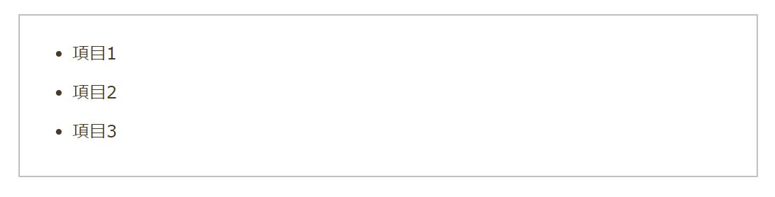
<fieldset>
<ul>
	<li>項目1</li>
	<li>項目2</li>
	<li>項目3</li>
</ul>
</fieldset>
リストのデザインを変更するCSSをいくつかご紹介してきました。
CSSをお使いのテーマのスタイルシートに追加して使って下さいね。
みっぴー
 ぱん猫
ぱん猫
canvaで使えるアイキャッチテンプレート150種類を作りました!