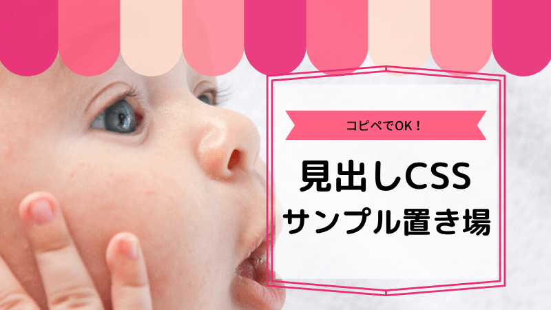

今回は、見出しの装飾CSSについて書きたいと思います。CSSとHTMLで「見出し(タイトル)」の様々なデザインを作ったのでご紹介します!
見出しは、「<h2>」「<h3>」「<h4>」「<h5>」などを用いて文章のタイトルや段落を分ける時に使いますが、記事内では必ず使うものですよね。
私も最初は苦戦しましたので今回は、初心者の方でも簡単に見出しのデザインを変更出来るようにコピペでOKな見出しの装飾CSSのサンプルを集めました。
そのサンプルを使うためのCSSの設定方法についても合わせてご紹介しています。
※また、お使いのテーマによっては、デザインが崩れてしまう場合もあるので「class」を使う見出しの設定方法も一緒にご紹介します。
 みっぴー
みっぴー
みっぴー(@bennriya_mi)です~。
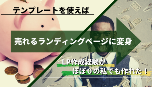
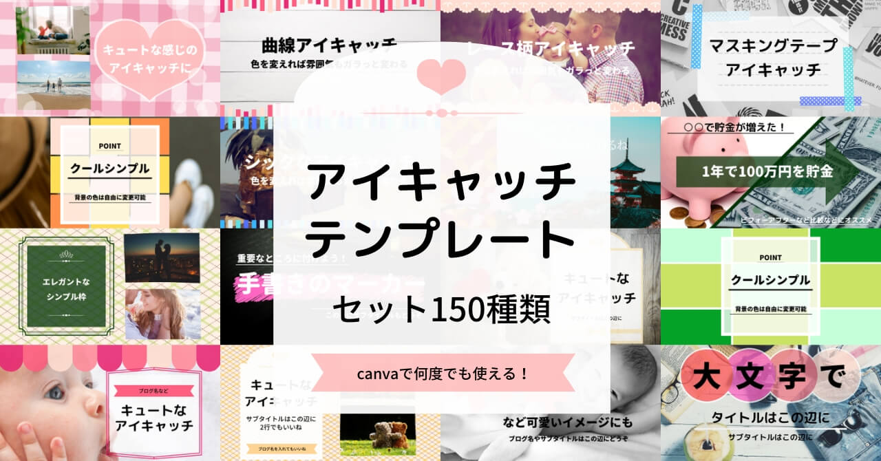
アイキャッチを変えただけで、広告表示回数が5倍になりました。(こっそり独り言)
今回、そのアイキャッチを誰でも使えるようにテンプレにしました。
詳しくは、下記にて
目次
- 見出しデザインの装飾CSSのサンプル
- 見出しデザインのサンプル見本
- アイコンなしの見出しデザインサンプル
- 1.左線
- 2.左線+下線
- 3.角が丸いボックス型
- 4.タグ風
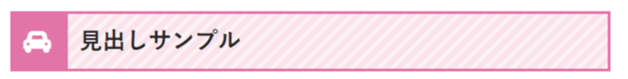
- 5.タグ風
- 6.左側を尖らせたような形
- 7.左側を尖らせたような形
- 8.文字が光っているように見えるバー
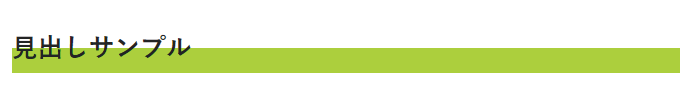
- 9.両側が浮いているように見えるバー
- 10.内側に凹んで見えるバー
- 11.吹き出し
- 12.蛍光ペン風
- 13.2色のボーダー
- 14.グラデーション
- 15.グラデーション
- 16.グラデーション
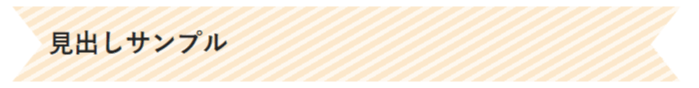
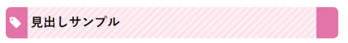
- 17.リボン風
- 18.リボン風
- 19.ボーダーのリボン
- 20.角が剥がれているようなデザイン
- 21.ステッチ風
- 22.ステッチ風
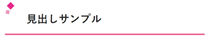
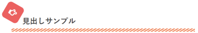
- 23.エアブラシ風
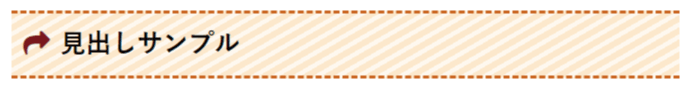
- 24.矢印
- 25.最初の文字のデザインを変える
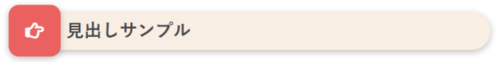
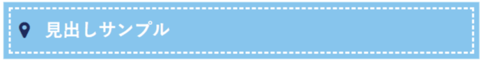
- 26.ボーダー
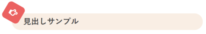
- 27.ボーダー
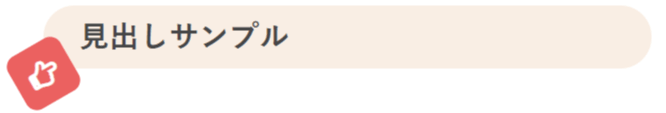
- 28.ボーダーの下線
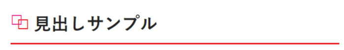
- 29.四角が二つ
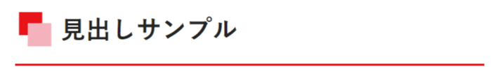
- 30.四角が二つ+色付け
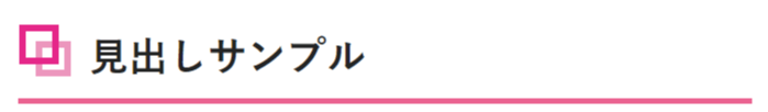
- 31.四角が二つの別デザイン
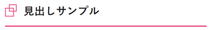
- 32.四角が二つの別デザイン
- 33.四角が二つの別デザイン
- アイコンを使った見出しデザインのサンプル
- 最後に
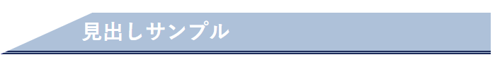
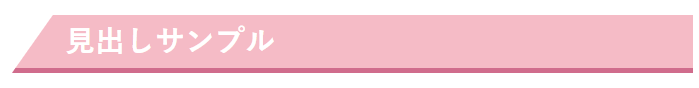
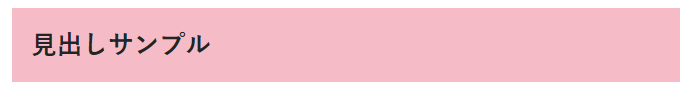
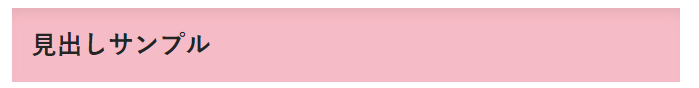
見出しデザインの装飾CSSのサンプル
見出しのデザインを変更するためのCSSとHTMLの書き方をご紹介します。こちらは、そのままコピペしてご自身のサイトで使って頂いても大丈夫です。
google Chromeだとデザインがすぐに反映されないので、CSSを変更したあとはキャッシュの削除をして確認してくださいね。
修正するファイル
今回のカスタマイズで編集するファイルは下記の通りです。
みっぴー
style.cssだけです!- style.css
見出しCSSの設定方法
見出しは、記事を読みやすくする為に必要なものです。今回は、様々なデザインの見出しCSSのサンプルを用意しました。
まずは、CSSの設定方法についてです。あなたのお使いのテーマの中に「style.css」のいうスタイルシートを探してください。
「外観」⇒「テーマの編集」⇒「子テーマ」⇒「style.css」
※子テーマを使ってない方は、「外観」⇒「テーマの編集」⇒「style.css」
その中に、下記で紹介する見出しのCSSをコピーして貼り付けるだけです。張り付けたあとは、ファイルを更新ボタンを忘れず押してくださいね。
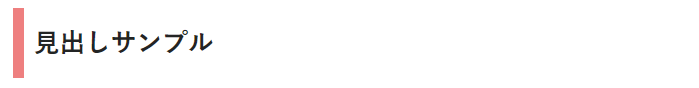
p#sample1{
 border-left: 7px solid #ff0000;
 padding: 7px;
 font-size: 18pt;
 font-weight: bold;
}記事作成画面では
記事作成画面のHTML入力は下記の通りです。
<h2>見出し2</h2>その場合は、「class」を使って設定すれば大丈夫です。
次は、「class」を使った見出しCSSの設定方法についてご紹介します。
「class」を使って見出しデザインを変更する方法
みっぴー
p#sample1{
 border-left: 7px solid #ff0000;
 padding: 7px;
 font-size: 18pt;
 font-weight: bold;
}あなたの分かりやすいものにしてもOKです。
記事作成画面では
記事作成画面では下記のように記載すれば「class」を使った見出しになります。
記事作成画面のHTML入力は下記の通りです。
<h2 class="p#sample1">見出し2</h2>下記のCSSサンプルをそのまま使う場合は、最初の「p#sample1」の部分と同じclass名になるようにしてください。
これで、見出しCSSの設定方法の説明は終わります。
みっぴー
見出しデザインのサンプル見本
まずは、見本です。それぞれ、何を設定しているのか簡単に説明しますのでサンプルを変更しあなただけのデザインに変更したい場合は参考にしてください。
.midasi00{
     color:#000; /*文字色*/
     background:#fff; /*背景色*/
     border-top:1px solid #ccc; /*上線の太さ、種類、色*/
     border-right:1px solid #ccc; /*右線の太さ、種類、色*/
     border-left:1px solid #ccc; /*左線の太さ、種類、色*/
     border-bottom:1px solid #ccc; /*下線の太さ、種類、色*/
     padding:.8em .9em .8em .9em; /*上下左右の間隔*/
     font-weight: bold; /*文字を太くする場合*/
     background-image:url(画像のURL); /*背景に使用する画像のURL*/
}
color
見出しの文字色をカラーコードで指定します。文字色を変更しない場合は、記載の必要はありません。
background
見出しの背景色をカラーコードで指定します。背景色を変更しない場合は、記載の必要はありません。
border(top,right,left,bottom)
「px」で線の太さを指定します。
線の種類は、「solid」の部分を変えれば点線など数種類の線が使用できます。下記に一例を載せておきます。
・solid(実線・1本線)
・double(2重線)
・dotted(点線)
・dashed(破線)
・groove(窪んだ線)
・ridge(隆起した線)
そのあと、線の色を#カラーコードで指定します。
padding
上下左右の間隔を指定します。
値を1つだけ記述した場合は「上下左右」の間隔を指定します。
値を2つ記述した場合は「上下」「左右」の間隔を指定します。
値を3つ記述した場合は「上」「左右」「下」の順に間隔を指定します。
値を4つ記述した場合は「上」「右」「下」「左」の順に間隔を指定します。
font-weight: bold
見出しの部分の文字を太くする場合は、記載します。
background-image
背景に画像を使用したい場合は画像のURLを記述します。画像を使わない場合は、記載の必要はありません。
では、ここから実際にコピペでOKな見出しCSSのサンプル集をご紹介していきます。
アイコンなしの見出しデザインサンプル
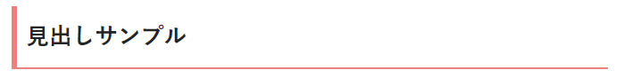
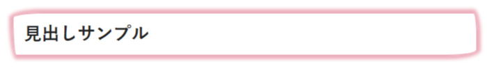
1.左線
p#sample1{
margin: 2em 0 1em 0;
border-left: 7px solid #ff8484;
padding: 7px;
font-weight: bold;
}
2.左線+下線
p#sample2{
margin: 2em 0 1em 0;
border-left: 4px solid #ff8484;
border-bottom: 1px solid #ff8484;
padding: 7px;
font-weight: bold;
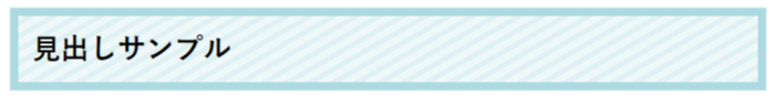
}3.角が丸いボックス型
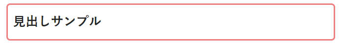
p#sample3{
margin: 2em 0 1em 0;
border: 2px solid #ff8484;
padding: 7px;
border-radius: 5px;
font-weight: bold;
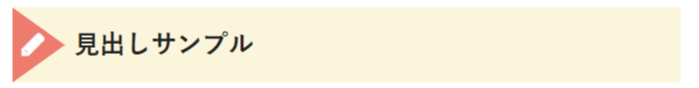
}4.タグ風
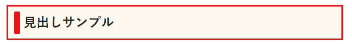
p#sample4{
margin: 2em 0 1em 0;
position: relative;
border: 2px solid #ff0000;
padding: 0.3em 0.3em 0.3em 1.2em;
background: #fffaf0;
font-weight: bold;
}

p#sample4:before{
content: "";
position: absolute;
background: #ff0000;
top: 50%;
left: 0.5em;
margin-top :-15px;
height: 30px;
width: 8px;
border-radius: 2px;
border-radius: 2px;
font-weight: bold;
}
5.タグ風
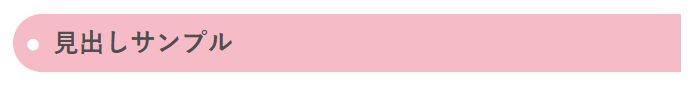
p#sample5{
margin: 2em 0 1em 0;
color: #505050;
font-weight: bold;
padding: 0.5em;
line-height: 1.3;
background: #ffc0cb;
vertical-align: middle;
border-radius: 25px 0px 0px 25px;
}

p#sample5:before {
content: '●';
color: white;
margin-right: 8px;
}
6.左側を尖らせたような形
p#sample6{
font-weight: bold;
position: relative;
padding: 5px 26px 5px 93px;
background: #b0c4de;
font-size: 20px;
color: #ffffff;
margin-left: -33px;
line-height: 1.3;
border-bottom: double 3px #000080;
}

p#sample6:before {
position: absolute;
content: '';
left: -2px;
top: -2px;
width: 0;
height: 0;
border: none;
border-bottom: solid 50px transparent;
border-left: solid 110px #ffffff;/*記事の背景の色と同じにする*/
z-index: 2;
}
7.左側を尖らせたような形
p#sample7{
font-weight: bold;
position: relative;
padding: 5px 26px 5px 40px;
background: #ffc0cb;
font-size: 20px;
color: #ffffff;
margin-left: -13px;
line-height: 1.3;
border-bottom: solid 3px #db7093;
}

p#sample7:before {
position: absolute;
content: '';
left: -2px;
top: -2px;
width: 0;
height: 0;
border: none;
border-bottom: solid 50px transparent;
border-left: solid 35px #ffffff;/*記事の背景の色と同じにする*/
z-index: 2;
}
8.文字が光っているように見えるバー

p#sample8{
margin: 2em 0 1em 0;
position: relative;
background: #191970;
color: #ffffff;
text-shadow: 0 0 5px #ffffff;
padding: 3px 3px 3px 10px;
font-weight: bold;
}
9.両側が浮いているように見えるバー
p#sample9{
margin: 2em 0 1em 0;
position: relative;
padding: .5em .75em;
background-color: #ffc0cb;
font-weight: bold;
}
p#sample9:before,
p#sample9:after {
position: absolute;
bottom: 8px;
z-index: -1;
content: '';
width: 30%;
height: 50%;
box-shadow: 0 10px 15px rgba(0, 0, 0, .2);
}
p#sample9:before {
-webkit-transform: rotate(-3deg);
transform: rotate(-3deg);
left: .3em;
}
p#sample9:after {
-webkit-transform: rotate(3deg);
transform: rotate(3deg);
right: .3em;
}
10.内側に凹んで見えるバー
p#sample10{
margin: 2em 0 1em 0;
padding: .5em .75em;
background: #ffc0cb;
box-shadow: 0 7px 10px -5px rgba(0, 0, 0, .1) inset;
font-weight: bold;
}
11.吹き出し
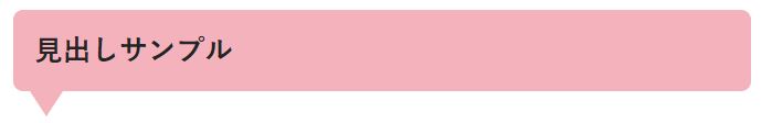
p#sample11{
margin: 2em 0 1em 0;
position: relative;
padding: .5em .75em;
background-color: #ffb6c1;
border-radius: 6px;
font-weight: bold;
}
p#sample11:after {
position: absolute;
top: 100%;
left: 10px;
content: '';
width: 0;
height: 0;
border: 10px solid transparent;
border-top: 15px solid #ffb6c1;
}
【オススメツールをちょっと紹介】
複数のASPを一括で管理する無料のツール
案件の報酬額を比較できるので、1番条件の良いASPを簡単に見つけることが出来ます!
12.蛍光ペン風
p#sample12{
margin: 2em 0 1em 0;
font-weight: bold;
background: linear-gradient(transparent 50%, #adff2f 0%);
}
13.2色のボーダー
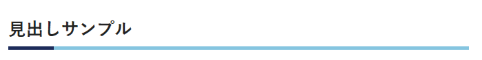
p#sample13{
margin: 2em 0 1em 0;
font-weight: bold;
border-bottom: solid 3px skyblue;
position: relative;
}
p#sample13:after {
position: absolute;
content: " ";
display: block;
border-bottom: solid 3px #000080;
bottom: -3px;
width: 10%;
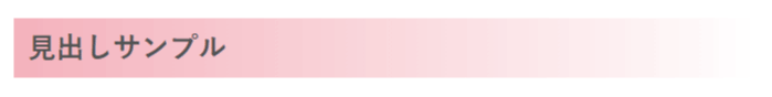
}14.グラデーション
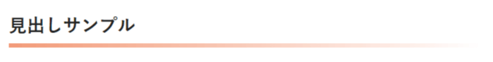
p#sample14{
margin: 2em 0 1em 0;
position: relative;
padding: 0.25em 0;
font-weight: bold;
}
p#sample14:after {
content: "";
display: block;
height: 4px;
background: -moz-linear-gradient(to right, rgb(255, 160, 122), transparent);
background: -webkit-linear-gradient(to right, rgb(255, 160, 122), transparent);
background: linear-gradient(to right, rgb(255, 160, 122), transparent);
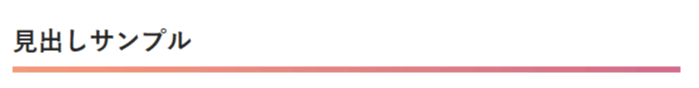
}15.グラデーション
p#sample15{
margin: 2em 0 1em 0;
font-weight: bold;
position: relative;
padding: 0.1em 0.5em;
background: -moz-linear-gradient(to right, rgb(255, 182, 193), transparent);
background: -webkit-linear-gradient(to right, rgb(255, 182, 193), transparent);
background: linear-gradient(to right, rgb(255, 182, 193), transparent);
color: #545454;
}
16.グラデーション
p#sample16{
margin: 2em 0 1em 0;
position: relative;
padding: 0.25em 0;
font-weight: bold;
}
p#sample16:after {
content: "";
display: block;
height: 4px;
background: -moz-linear-gradient(to right, rgb(255, 160, 122), #db7093);
background: -webkit-linear-gradient(to right, rgb(255, 160, 122), #db7093);
background: linear-gradient(to right, rgb(255, 160, 122), #db7093);
}
17.リボン風
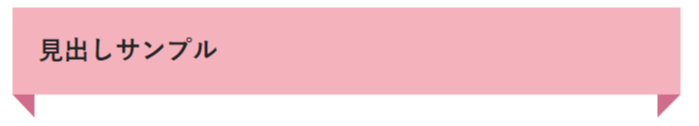
p#sample17{
margin: 2em 0 1em 0;
position: relative;
padding: .75em 1em;
background-color: #ffb6c1;
font-weight: bold;
}
p#sample17:before,
p#sample17:after {
content: '';
position: absolute;
top: 100%;
border-style: solid;
border-color: transparent;
}
p#sample17:before {
left: 0;
border-width: 0 15px 15px 0;
border-right-color: #db7093;
}
p#sample17:after {
right: 0;
border-style: solid;
border-width: 15px 15px 0 0;
border-top-color: #db7093;
}
18.リボン風
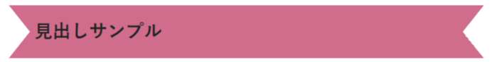
p#sample18{
margin: 2em 0 1em 0;
position: relative;
height: 50px;
line-height: 50px;
padding-left: 1.4em;
background-color: #db7093;
font-weight: bold;
}
p#sample18:before,
p#sample18:after {
content: '';
position: absolute;
}
p#sample18:before {
top: 0;
left: 0;
z-index: 2;
border-width: 25px 20px;
border-style: solid;
border-color: transparent;
border-left-color: #fff;
}
p#sample18:after {
top: 0;
right: 0;
z-index: 2;
border-width: 25px 20px;
border-style: solid;
border-color: transparent;
border-right-color: #fff;
}
19.ボーダーのリボン
p#sample19{
margin: 2em 0 1em 0;
position: relative;
height: 50px;
line-height: 50px;
padding-left: 1.4em;
background: -webkit-repeating-linear-gradient(-30deg, #fffaf0, #fffaf0 3px,#ffebcd 3px, #ffebcd 7px);
background: repeating-linear-gradient(-30deg, #fffaf0, #fffaf0 3px,#ffebcd 3px, #ffebcd 7px);
font-weight: bold;
}
p#sample19:before,
p#sample19:after {
content: '';
position: absolute;
}
p#sample19:before {
top: 0;
left: 0;
z-index: 2;
border-width: 25px 20px;
border-style: solid;
border-color: transparent;
border-left-color: #fff;
}
p#sample19:after {
top: 0;
right: 0;
z-index: 2;
border-width: 25px 20px;
border-style: solid;
border-color: transparent;
border-right-color: #fff;
}
20.角が剥がれているようなデザイン
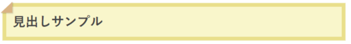
p#sample20{
margin: 2em 0 1em 0;
position: relative;
background: #fffacd;
box-shadow: 0px 0px 0px 5px #f0e68c;
padding: 0.2em 0.5em;
color: #454545;
font-weight: bold;
}
p#sample20:after{
position: absolute;
content: '';
left: -7px;
top: -7px;
border-width: 0 0 15px 15px;
border-style: solid;
border-color: #fff #fff #deb887;
box-shadow: 1px 1px 1px rgba(0, 0, 0, 0.15);
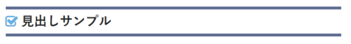
}21.ステッチ風
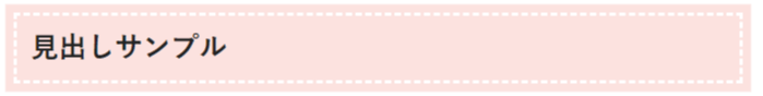
p#sample21{
margin: 2em 0 1em 0;
position: relative;
background: #ffe4e1;
box-shadow: 0px 0px 0px 5px #ffe4e1;
border: dashed 2px #ffffff;
padding: 0.2em 0.5em;
font-weight: bold;
}box-shadow: 0px 0px 0px 5px #ffe4e1;
上記の二カ所の色を同じにするとキレイなステッチ風になります。
22.ステッチ風
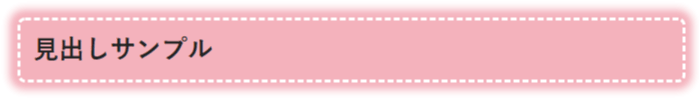
p#sample22{
margin: 2em 0 1em 0;
position: relative;
padding: 0.2em 0.5em;
background:#FFB6C1;
border: 2px dashed #fff;
border-radius:5px;
box-shadow: 0 0 5px 5px #FFB6C1;
font-weight: bold;
}
23.エアブラシ風
p#sample23{
position: relative;
padding: 1em;
border-radius: 4em .6em 4em .6em/.8em 3em .9em 5em;
border: 1px solid  #f4b3c2;
font-weight: bold;
margin: 2em 0 1em 0;
padding: 0.2em 0.2em 0.2em 0.6em;
box-shadow: 0 0 3px 3px #f4b3c2;
}
24.矢印

p#sample24{
margin: 2em 0 1em 0;
position: relative;
padding-left: 43px;
border-bottom: solid 3px #00008b;
font-weight: bold;
}

p#sample24:before {
position: absolute;
content: '';
bottom: -3px;
left: -0.5em;
width: 0;
height: 0;
border-left: solid 35px transparent;
border-bottom: solid 15px #00008b;
}
25.最初の文字のデザインを変える

p#sample25:first-letter {
margin: 2em 0 1em 0;
font-size: 2.5em;
color: #000080;
font-weight: bold;
}
26.ボーダー
p#sample26{
margin: 2em 0 1em 0;
position: relative;
font-weight: bold;
background: -webkit-repeating-linear-gradient(-30deg, #e0ffff, #e0ffff 3px,#f0ffff 3px, #f0ffff 7px);
background: repeating-linear-gradient(-30deg, #e0ffff, #e0ffff 3px,#f0ffff 3px, #f0ffff 7px);
box-shadow: 0px 0px 0px 5px #b0e0e6;
padding: 0.2em 0.5em;
color: #000000;
}
27.ボーダー
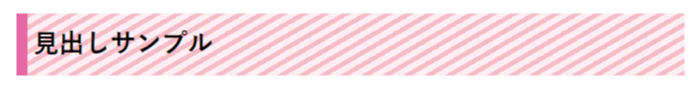
p#sample27{
margin: 2em 0 1em 0;
color: #000000;
font-weight: bold;
padding: 0.25em;
border-left: solid 7px #ff69b4;
background: -webkit-repeating-linear-gradient(-30deg, #ffc0cb, #ffc0cb 3px,#fff0f5 3px, #fff0f5 7px);
background: repeating-linear-gradient(-30deg, #ffc0cb, #ffc0cb 3px,#fff0f5 3px, #fff0f5 7px);
}
28.ボーダーの下線
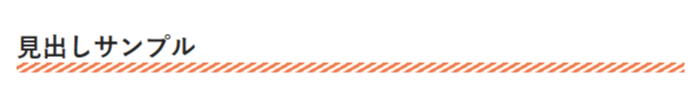
p#sample28{
margin: 2em 0 1em 0;
position: relative;
font-weight: bold;
}

p#sample28:after {
content: "";
position: absolute;
left: 0;
bottom: 0;
width: 100%;
height: 7px;
background: -webkit-repeating-linear-gradient(-30deg, #ff7f50, #ff7f50 2px, #fffaf0 2px, #fffaf0 4px);
background: repeating-linear-gradient(-30deg, #ff7f50, #ff7f50 2px, #fffaf0 2px, #fffaf0 4px);
}
29.四角が二つ
p#sample29{
position: relative;
font-size: 18pt;
font-weight: bold;
margin: 0 0 1.5em;
padding: 0.2em 0 0.1em 1.3em;
border-bottom: 2px solid #ff0000;
}

p#sample29:before{
content: "□";
font-size: 120%;
position: absolute;
color: #ff0000;
top: -0.1em;
left: 0.3em;
height: 10px;
width: 12px;
}

p#sample29:after{
content: "□";
font-size: 120%;
position: absolute;
color: #ff1493;
top: -0.3em;
left: 0;
height: 10px;
width: 12px;
}
30.四角が二つ+色付け
p#sample30{
position: relative;
font-size: 18pt;
font-weight: bold;
margin: 0 0 1.5em;
padding: 0.2em 0 0.4em 1.8em;
border-bottom: 2px solid #ff0000;
}

p#sample30:before{
content: "■";
font-size: 200%;
position: absolute;
color: #ff0000;
top: -30px;
left: 0.5px;
width: 18px;
height: 19px;
}

p#sample30:after{
content: "■";
font-size: 200%;
position: absolute;
color: #ffb6c1;
top: -19px;
left: 9px;
width: 15px;
height: 15px;
}
31.四角が二つの別デザイン
p#sample31{
position: relative;
font-size: 18pt;
font-weight: bold;
margin: 0 0 1.5em;
padding: 0.1em 0 0.1em 1.8em;
border-bottom: 3px solid #ff6699;
}

p#sample31:before {
position:  absolute;
top: 16px;
left: 11px;
width: 13px;
height: 13px;
border: 4px solid #ff99cf;
content: "";
}

p#sample31:after {
position:  absolute;
top: 6px;
left: 1px;
width: 16px;
height: 16px;
border: 4px solid #ff1493;
content: "";
}
32.四角が二つの別デザイン
p#sample32{
position: relative;
font-size: 18pt;
font-weight: bold;
margin: 0 0 1.5em;
padding: 0.2em 0 0.4em 1.7em;
border-bottom: 3px solid #ff6699;
}

p#sample32:before {
position: absolute;
top: 20px;
left: 0;
width: 16px;
height: 16px;
border: 2px solid #ff6699;
content: "";
}

p#sample32:after {
position: absolute;
top: 12px;
left: 9px;
width: 13px;
height: 13px;
border: 2px solid #ff6699;
content: "";
}
33.四角が二つの別デザイン
p#sample33{
position: relative;
font-size: 18pt;
font-weight: bold;
margin: 0 0 1.5em;
padding: 0.2em 0.5em 0.4em 2em;
border-bottom: 3px solid #ff6699;
}

p#sample33:before {
position: absolute;
top: -8px;
left: 7px;
transform: rotate(45deg);
-webkit-transform: rotate(45deg);
height: 12px;
width: 12px;
background: #ff1493;
content: "";
}

p#sample33:after {
position: absolute;
top: 8px;
left: 2px;
transform: rotate(15deg);
-webkit-transform: rotate(15deg);
height: 8px;
width: 8px;
background: #ff99cf;
content: "";
}アイコンを使った見出しデザインのサンプル
みっぴー
FontAwesomeを使うには、wordPressのヘッダーに下記の一文を入れるだけで使用が可能です。
(もう一つ、アイコンをダウンロードして使う方法もありますが私的には、この方法がオススメなので、ダウンロードして使う方法の説明は省かせてもらいます)
下記のコードをコピーして、お使いのテーマの編集でヘッダー部分に入れてください。
※お使いのテーマによっては、この作業は不要の場合があります。テーマにFontAwesomeのアイコンを使った見出しやボックスなどが用意されている場合は、ほぼこの作業はなくアイコンが出ると思います。
みっぴー
<link href="https://maxcdn.bootstrapcdn.com/font-awesome/4.7.0/css/font-awesome.min.css" rel="stylesheet">上記コードを<head>〜</head>の中に貼り付けてください。
これで、アイコンが表示されると思います。
アイコンを変更する場合
アイコンを変えたい場合は、FontAwesomeのサイトのアイコン一覧から好きなアイコンを選びその中に書いてあるUnicode:をコピーして変更すればOKです。
content: "\f046";の部分をそのアイコンのユニコードに変更すればOKです!
34.二重線とアイコン
p#sample34{
margin: 2em 0 1em 0;
position: relative;
padding-left: 1.2em;
padding-top: 0.3em;
padding-bottom: 0.3em;
padding-right: 0.3em;
line-height: 1.4;
border-top: 3px double #00008b;
border-bottom: 3px double #00008b;
font-weight: bold;
}

p#sample34:before{ font-family: FontAwesome;
content: "\f046";
position: absolute;
left: 0;
color: #5ab9ff;
top: 50%;
-moz-transform: translateY(-50%);
-webkit-transform: translateY(-50%);
-ms-transform: translateY(-50%);
transform: translateY(-50%);
}
35.アイコン付きのボーダー
p#sample35{
margin: 2em 0 1em 0;
position: relative;
color: #000000;
font-weight: bold;
border-top: dashed 2px #d2691e;
border-bottom: dashed 2px #d2691e;
padding-left: 1.9em;
padding-top: 0.25em;
padding-right: 0.25em;
padding-bottom: 0.25em;
background: -webkit-repeating-linear-gradient(-30deg, #fffaf0, #fffaf0 3px,#ffebcd 3px, #ffebcd 7px);
background: repeating-linear-gradient(-30deg, #fffaf0, #fffaf0 3px,#ffebcd 3px, #ffebcd 7px);
}

p#sample35:before{
font-family: FontAwesome;
content: "\f064";
position: absolute;
font-size: 1em;
left: 0.5em;
color: #800000;
}
36.両線とボーダー
p#sample36{
margin: 2em 0 1em 0;
position: relative;
line-height: 200%;
color: #000000;
font-weight: bold;
border-left: 29px solid #f279b2;
border-right: 29px solid #f279b2;
padding: 10px;
border-radius: 7px;
padding: 0.25em;
background: -webkit-repeating-linear-gradient(-45deg, #fef4f4, #fef4f4 3px,#ffe6f2 3px, #ffe6f2 7px);
background: repeating-linear-gradient(-45deg, #fef4f4, #fef4f4 3px,#ffe6f2 3px, #ffe6f2 7px);
}

p#sample36:before{
font-family: FontAwesome;
content: "\f02b";
position: absolute;
padding: 0em;
color: #ffffff;
font-weight: normal;
left: -1.35em;
top: 50%;
-moz-transform: translateY(-50%);
-webkit-transform: translateY(-50%);
-ms-transform: translateY(-50%);
transform: translateY(-50%);
}
37.左にアイコン

p#sample37{
margin: 2em 0 1em 0;
position: relative;
background: -webkit-repeating-linear-gradient(-30deg, #fffaf0, #fffaf0 3px,#ffebcd 3px, #ffebcd 7px);
background: repeating-linear-gradient(-30deg, #fffaf0, #fffaf0 3px,#ffebcd 3px, #ffebcd 7px);
padding: 0.25em 0.5em;
border-left: solid 2.5em #ffa07a;
font-weight: bold;
}

p#sample37:before {
font-family: FontAwesome;
content: "\f001";
position: absolute;
padding: 0em;
color: white;
left: -1.75em;
top: 50%;
-moz-transform: translateY(-50%);
-webkit-transform: translateY(-50%);
-ms-transform: translateY(-50%);
transform: translateY(-50%);
}
38.左にアイコン
p#sample38{
margin: 2em 0 1em 0;
position: relative;
background: -webkit-repeating-linear-gradient(-45deg, #fef4f4, #fef4f4 3px,#ffe6f2 3px, #ffe6f2 7px);
background: repeating-linear-gradient(-45deg, #fef4f4, #fef4f4 3px,#ffe6f2 3px, #ffe6f2 7px);
padding: 0.25em 0.5em;
border-left: solid 2.5em #f279b2;
border-top: solid 0.1em #f279b2;
border-bottom: solid 0.1em #f279b2;
border-right: solid 0.1em #f279b2;
font-weight: bold;
}

p#sample38:before {
font-family: FontAwesome;
content: "\f1b9";
position: absolute;
padding: 0em;
color: #ffffff;
left: -1.89em;
top: 50%;
-moz-transform: translateY(-50%);
-webkit-transform: translateY(-50%);
-ms-transform: translateY(-50%);
transform: translateY(-50%);
}
39.両側にアイコン

p#sample39{
margin: 2em 0 1em 0;
position: relative;
background: -webkit-repeating-linear-gradient(-30deg, #fffaf0, #fffaf0 3px,#ffebcd 3px, #ffebcd 7px);
background: repeating-linear-gradient(-30deg, #fffaf0, #fffaf0 3px,#ffebcd 3px, #ffebcd 7px);
padding: 0.25em 0.5em;
border-left: solid 2.5em #ffa07a;
border-right: solid 2.5em #ffa07a;
font-weight: bold;
}

p#sample39:before {
font-family: FontAwesome;
content: "\f001";
position: absolute;
padding: 0em;
color: white;
left: -1.75em;
top: 50%;
-moz-transform: translateY(-50%);
-webkit-transform: translateY(-50%);
-ms-transform: translateY(-50%);
transform: translateY(-50%);
}

p#sample39:after {
font-family: FontAwesome;
content: "\f001";
position: absolute;
padding: 0em;
color: white;
right: -1.75em;
top: 50%;
-moz-transform: translateY(-50%);
-webkit-transform: translateY(-50%);
-ms-transform: translateY(-50%);
transform: translateY(-50%);
}
40.左側にアイコン
p#sample40{
margin: 2em 0 1em 0;
position: relative;
background: #faf0e6;
padding: 2px 5px 2px 38px;
font-weight: bold;
color: #474747;
border-radius: 0em 10em 10em 0em;
box-shadow: 0 2px 6px rgba(0, 0, 0, .25);
}

p#sample40:before {
font-family: FontAwesome;
content: "\f0a4";
display: inline-block;
position: absolute;
padding: 0em;
color: white;
background: #ff6363;
width: 50px;
text-align: center;
height: 50px;
line-height: 50px;
left: -1em;
top: 50%;
-moz-transform: translateY(-50%);
-webkit-transform: translateY(-50%);
-ms-transform: translateY(-50%);
transform: translateY(-50%);
border-radius: 20%;
box-shadow: 0 2px 6px rgba(0, 0, 0, .25);
}
41.左側のアイコンの位置をちょっと上に
p#sample41{
position: relative;
background: #faf0e6;
padding: 2px 5px 2px 24px;
font-weight: bold;
color: #474747;
border-radius: 10em;
margin: 2.5em 1em 1em 1em;
}
p#sample41:before {
font-family: FontAwesome;
content: "\f0a4";
transform: rotate(30deg);
display: inline-block;
position: absolute;
padding: 0em;
color: white;
background: #ff6363;
width: 40px;
text-align: center;
height: 40px;
line-height: 40px;
left: -1em;
top: -60%;
border-radius: 20%;
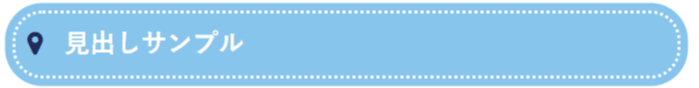
}42.左側のアイコンの位置をちょっと下に
p#sample42{
position: relative;
background: #faf0e6;
padding: 2px 5px 2px 24px;
font-weight: bold;
font-size: 20px;
color: #474747;
border-radius: 10em;
margin: 1em 1em 2.5em 1em;
}

p#sample42:before {
font-family: FontAwesome;
content: "\f0a4";
transform: rotate(-30deg);
display: inline-block;
position: absolute;
padding: 0em;
color: white;
background: #ff6363;
width: 40px;
text-align: center;
height: 40px;
line-height: 40px;
left: -1em;
top: 60%;
border-radius: 20%;
}
43.左側のアイコンの位置をちょっと上に
p#sample43{
position: relative;
padding: 2px 5px 2px 24px;
font-weight: bold;
color: #474747;
margin: 3.5em 1em 1em 1em;
}

p#sample43:before {
font-family: FontAwesome;
content: "\f0a4";
transform: rotate(30deg);
display: inline-block;
position: absolute;
padding: 0em;
color: white;
background: #ff6363;
width: 40px;
text-align: center;
height: 40px;
line-height: 40px;
left: -1em;
top: -60%;
border-radius: 20%;
}

p#sample43:after {
content: "";
position: absolute;
left: 0;
bottom: -0.3em;
width: 100%;
height: 7px;
background: -webkit-repeating-linear-gradient(-30deg, #ff7f50, #ff7f50 2px, #fffaf0 2px, #fffaf0 4px);
background: repeating-linear-gradient(-30deg, #ff7f50, #ff7f50 2px, #fffaf0 2px, #fffaf0 4px);
}
44.立体的なバーにアイコン
p#sample44{
margin: 2em 0 1em 0;
position: relative;
padding: 10px 18px 10px 29px;
line-height: 1.4;
background:#d35400;
color: #fff;
box-shadow: 0 2px 6px rgba(0, 0, 0, .25);
font-weight: bold;
}

p#sample44:before{
font-family: FontAwesome;
content: "\f004";
position: absolute;
left: 0.5em;
color: #ffebcd;
top: 50%;
-moz-transform: translateY(-50%);
-webkit-transform: translateY(-50%);
-ms-transform: translateY(-50%);
transform: translateY(-50%);
}
45.ステッチ風にアイコン
p#sample45{
margin: 2em 0 1em 0;
position: relative;
background: #87cefa;
box-shadow: 0px 0px 0px 5px #87cefa;
border: dashed 2px #ffffff;
padding-left: 1.9em;
padding-top: 0.25em;
padding-right: 0.25em;
padding-bottom: 0.25em;
font-weight: bold;
color: #ffffff;
}

p#sample45:before{
font-family: FontAwesome;
content: "\f041";
position: absolute;
font-size: 1em;
left: 0.5em;
color: #191970;
}
46.ステッチ風にアイコン(丸型)
p#sample46{
margin: 2em 0 1em 0;
position: relative;
background: #87cefa;
box-shadow: 0px 0px 0px 5px #87cefa;
border: dotted 2px #ffffff;
padding-left: 1.9em;
padding-top: 0.25em;
padding-right: 0.25em;
padding-bottom: 0.25em;
font-weight: bold;
color: #ffffff;
border-radius: 20px;
}

p#sample46:before{
font-family: FontAwesome;
content: "\f041";
position: absolute;
font-size: 1em;
left: 0.5em;
color: #191970;
}
47.三角形にアイコン
p#sample47{
margin: 2em 0 1em 0;
position: relative;
height: 50px;
line-height: 50px;
padding-left: 2.4em;
background-color: #fff8dc;
font-weight: bold;
}
p#sample47:before {
content: '';
position: absolute;
top: 0;
left: 0;
z-index: 2;
border-width: 25px 35px;
border-style: solid;
border-color: transparent;
border-left-color: #fa8072;
z-index: 1;
}
p#sample47:after {
font-family: FontAwesome;
content: "\f040";
line-height: 40px;
position: absolute;
padding: 0em;
color: #ffffff;
left: 0.4em;
top: 50%;
-moz-transform: translateY(-50%);
-webkit-transform: translateY(-50%);
-ms-transform: translateY(-50%);
transform: translateY(-50%);
z-index: 2;
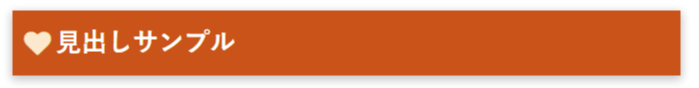
}48.タグ付きのバー
p#sample48{
position: relative;
color: black;
border-top: double 3px #ffa500;
border-bottom: double 3px #ffa500;
background: #ffebcd;
line-height: 1.4;
padding: 0.25em 0.5em;
margin: 2em 0 0.5em;
font-weight: bold;
}

p#sample48:after {
position: absolute;
font-family: FontAwesome;
content: '\f0e5\ 注目!';
line-height: 1.3;
background: #ffa500;
color: #fff;
left: -0.3px;
bottom: 100%;
border-radius: 30px 30px 0 0;
padding: 3px 10px 1px;
font-size: 0.7em;
letter-spacing: 0.1em;
}
49.タグ付きのバー
p#sample49{
position: relative;
font-weight: bold;
border-top: solid 2px #ffd700;
border-right: solid 2px #ffd700;
border-left: solid 2px #ffd700;
border-bottom: solid 2px #ffd700;
line-height: 1.4;
margin: 2em 0 1em;
padding: 0.3em 0.5em;
background: -webkit-repeating-linear-gradient(30deg, #fffff0, #fffff0 3px,#ffefd5 3px, #ffefd5 7px);
background: repeating-linear-gradient(30deg, #fffff0, #fffff0 3px,#ffefd5 3px, #ffefd5 7px);
}

p#sample49:after {
position: absolute;
font-family: FontAwesome;
content: '\f071\ 注目';
line-height: 1.3;
background: #ffd700;
color: #000000;
left: -2px;
font-weight: bold;
bottom: 100%;
border-radius: 5px 5px 0 0;
padding: 5px 7px 3px;
font-size: 0.7em;
}
50.タグ付きのバー
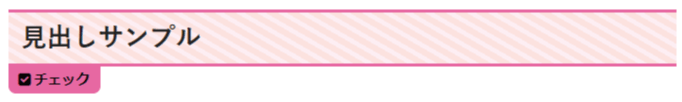
p#sample50{
position: relative;
font-weight: bold;
border-top: solid 2px #ff69b4;
border-bottom: solid 2px #ff69b4;
line-height: 1.4;
margin: 2em 0 2em;
padding: 0.3em 0.5em;
background: -webkit-repeating-linear-gradient(30deg, #fff0f5, #fff0f5 3px,#ffe4e1 3px, #ffe4e1 7px);
background: repeating-linear-gradient(30deg, #fff0f5, #fff0f5 3px,#ffe4e1 3px, #ffe4e1 7px);
}
p#sample50:after {
position: absolute;
font-family: FontAwesome;
content: '\f14a\ チェック';
line-height: 1.3;
background: #ff69b4;
color: #000000;
left: 0;
font-weight: bold;
top: 100%;
border-radius: 0 0 5px 5px;
padding: 5px 7px 3px;
font-size: 0.55em;
letter-spacing: -0.01em;
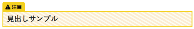
}51.ワンポイント
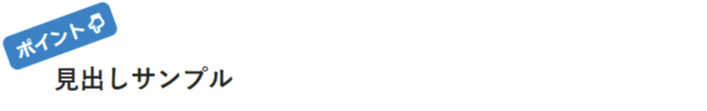
p#sample51{
position: relative;
font-weight: bold;
line-height: 1.4;
margin: 4em 0 0.5em;
padding: 0.8em 0.8em;
}

p#sample51:after {
position: absolute;
font-family: FontAwesome;
content: '\ポイント \f0a7';
transform: rotate(-20deg);
line-height: 1.3;
background: #1e90ff;
color: #ffffff;
left: -20px;
font-weight: bold;
bottom: 85%;
border-radius: 5px;
padding: 5px 7px 3px;
font-size: 0.7em;
}
52.ワンポイント付きのバー
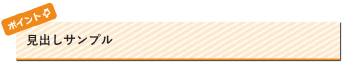
p#sample52{
position: relative;
font-weight: bold;
line-height: 1.4;
margin: 4em 0 0.5em;
padding: 0.8em 0.8em;
border-bottom: 2px solid #ff8c00;
background: -webkit-repeating-linear-gradient(-30deg, #fffaf0, #fffaf0 3px,#ffebcd 3px, #ffebcd 7px);
background: repeating-linear-gradient(-30deg, #fffaf0, #fffaf0 3px,#ffebcd 3px, #ffebcd 7px);
box-shadow: 1px 1px 1px;
}

p#sample52:after {
position: absolute;
font-family: FontAwesome;
content: '\ポイント \f0a7';
transform: rotate(-20deg);
line-height: 1.3;
background: #ff8c00;
color: #ffffff;
left: -20px;
font-weight: bold;
bottom: 85%;
border-radius: 5px;
padding: 5px 7px 3px;
font-size: 0.7em;
}
53.ワンポイント
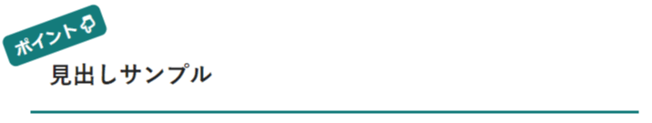
p#sample53{
position: relative;
font-weight: bold;
line-height: 1.4;
margin: 4em 0 0.5em;
padding: 0.8em 0.8em;
border-bottom: 2px solid #008080;
}

p#sample53:after {
position: absolute;
font-family: FontAwesome;
content: '\ポイント \f0a7';
transform: rotate(-20deg);
line-height: 1.3;
background: #008080;
color: #ffffff;
left: -20px;
font-weight: bold;
bottom: 85%;
border-radius: 5px;
padding: 5px 7px 3px;
font-size: 0.7em;
}
最後に
みっぴー
参考にしてください!
canvaで使えるアイキャッチテンプレート150種類を作りました!